| Author | Thread |
Comments Made During the Challenge  |
|
|
12/07/2005 06:43:01 PM |
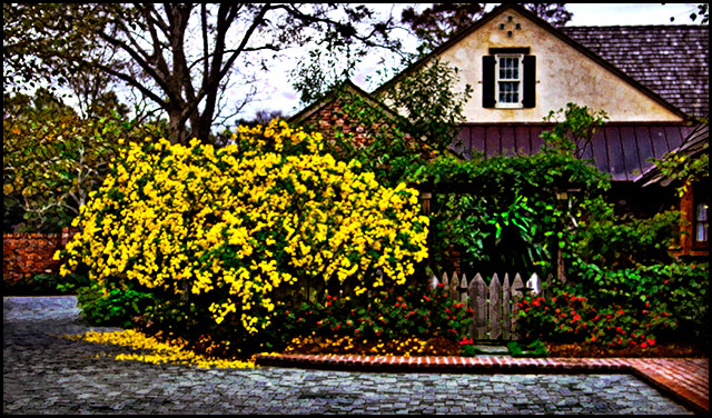
| I absolutely love the colors, but I don't think that it makes up for a lack of focus or the blown out bits around the tree. |
|
|
|
12/07/2005 06:38:27 PM |
| For my taste: too much saturation, too much contrast, and too much shapening. The capture without the processing in interesting. 4 |
|
|
|
12/07/2005 11:42:02 AM |
| The editing is way too overdone in this photo for my taste, but I'll give you a credit for trying to do something different though. |
|
|
|
12/06/2005 08:56:47 PM |
| The effect used was done too much and lost quite a bit of detail within the photo. 2 |
|
|
|
12/06/2005 01:10:38 AM |
| A very pleasant scene. I like the yellow bush. The image though looks very un-natural to me, an an uncomfortable way. Like some effect filter in ps or something. |
|
|
|
12/05/2005 10:56:58 PM |
| Lot of colors but sems too contrasty to me and focus seems off a bit. |
|
|
|
12/05/2005 01:25:36 PM |
| Great colors and shapes throughout make this visually ineresting to look at. Nice mix of textures too. The sharpness/contrast effect (photoshop filter?) is not my favorite, but nice shot nonetheless. |
|
|
|
12/05/2005 11:16:21 AM |
| Beautiful little set up. Image is way overworked though. BOL |
|
|
|
12/05/2005 09:18:47 AM |
| way too contrasty, would prefer softer |
|
|
|
12/04/2005 08:47:44 PM |
| A charming cottage sceen that would be very appealing to the eye if not for the oversaturation of colors and high contrast. Toned done a notch to the natural colors then it will be a pleasant little scene showing a cozy and colorful cottage just around the cobblestone street. |
|
 Photographer found comment helpful. Photographer found comment helpful. |
|
|
12/04/2005 03:10:21 PM |
| Nice composition, but personally, I find the colors significantly oversaturated and the whole image quality has suffered though excessive post-processing (again, for me). Well worth starting over and try a more subtle approach I think. |
|
|
|
12/04/2005 01:33:14 PM |
|
|
|
12/03/2005 04:54:48 AM |
| Over-saturated and blurry - but I guess you've been told that already... |
|
| Photographer found comment helpful. |
|
|
12/02/2005 11:47:11 AM |
| Good luck with this study. |
|
|
|
12/02/2005 10:53:45 AM |
| Some interesting colours but too over-processes. Rather painful to the eye. |
|
| Photographer found comment helpful. |
|
|
12/02/2005 09:13:15 AM |
|
| Photographer found comment helpful. |
|
|
12/02/2005 12:04:36 AM |
| Too Photoshoped for my taste. Looks more like a painting than a photograph. Although if it were reverted back to pure photo, it looks like it would be quite nice. |
|
| Photographer found comment helpful. |
|
|
12/01/2005 10:02:25 PM |
| Appears over saturated.IMO |
|
| Photographer found comment helpful. |
|
|
12/01/2005 05:28:45 PM |
|
| Photographer found comment helpful. |
Home -
Challenges -
Community -
League -
Photos -
Cameras -
Lenses -
Learn -
Help -
Terms of Use -
Privacy -
Top ^
DPChallenge, and website content and design, Copyright © 2001-2025 Challenging Technologies, LLC.
All digital photo copyrights belong to the photographers and may not be used without permission.
Current Server Time: 03/14/2025 09:27:59 AM EDT.