| Author | Thread |
|
|
05/28/2006 10:44:03 PM |
*Critique Club*
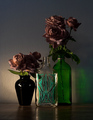
I simply LOVE the comments you got on this shot.
Nice job on the lighting with this one. -- the reflection on the glass is a bit distracting.
Too bad your back drop is wrinkly. -- great background
needs better lighting -- you really did do a great job using the lighting
So, what have we learned? Not a darned thing. lol Beauty is subjective, and that is screamed in the comments you received. I'll throw in my subjective advice too.
My very first impression of the photo was that the background had creases, and I wished that I could see the label a bit better.
The focus on the photo is very nice, but off just enough to make the small lettering look a little fuzzy and hard to get much detail out of. Even if I couldn't read it, I would like to see it crisp.
Now, lets talk about the background for a sec. I personally like the color. the darkness is good and goes well with the ground cloth and helps show the color of the subjects well in my opinion. The creases bug me to death. There is a crease horizontally through the photo and also one coming straight out the top of the bottle. Very distracting. I do not so much mind the wrinkles, I think actually, I would prefer a wrinkled/textured background to a solid dark one, so that doesn't bug me, but the creases are too much.
I like the set up. One thing that the commenters who mentioned it all agree on is that they wish the rose were real. To me, it's not a huge deal, but fake flowers remind me of funerals, real flowers remind me of love/romance/elegance. This, would in the end, be more effective with a real flower, but probably only matters to people who sit here analyzing these things.
Overall, great shot for the challenge, nicely set up, but needs a cleaner background. (but not too clean)
~Heather~ |
|
 Photographer found comment helpful. Photographer found comment helpful. |
Comments Made During the Challenge  |
|
|
05/23/2006 10:22:25 AM |
| While I think the background material is too dark for the subject, you really did do a great job using the lighting and reflections to create separation between the two. |
|
| Photographer found comment helpful. |
|
|
05/21/2006 11:44:07 PM |
| great deep colour and great background...well done...one of the better ones in this...only wish the rose was real |
|
| Photographer found comment helpful. |
|
|
05/19/2006 06:27:59 PM |
|
| Photographer found comment helpful. |
|
|
05/19/2006 01:00:34 AM |
| I'm 322 pictures into voting on this challenge, and get rewarded with this beautiful photo. Wonderful. |
|
| Photographer found comment helpful. |
|
|
05/18/2006 03:57:14 PM |
| A real rose would have been a nice touch. I think the plastic distracts. Otherwise, nice textures. |
|
| Photographer found comment helpful. |
|
|
05/18/2006 08:55:57 AM |
| This meets the challenge � it�s inanimate and arranged. Needs to straighten up and fly right. Stylistically consistent. 6 |
|
| Photographer found comment helpful. |
|
|
05/18/2006 12:23:12 AM |
|
| Photographer found comment helpful. |
|
|
05/18/2006 12:01:35 AM |
| What a WONDERFUL Old World feeling!!! PERFECT |
|
| Photographer found comment helpful. |
|
|
05/17/2006 11:34:03 PM |
| I like the composition and colors. the reflection on the glass is a bit distracting. |
|
| Photographer found comment helpful. |
|
|
05/17/2006 09:37:29 PM |
| Too bad your back drop is wrinkly. |
|
| Photographer found comment helpful. |
|
|
05/17/2006 02:13:19 PM |
| Nice job on the lighting with this one. I know how hard it is to get lighting to look right when it's reflected off bottles and glasses like that. You pulled it off very nicely. |
|
| Photographer found comment helpful. |
|
|
05/17/2006 01:16:00 AM |
| Now this is again what I call a "still life"..... I like this set up as it is simple, yet stylish..... |
|
| Photographer found comment helpful. |
Home -
Challenges -
Community -
League -
Photos -
Cameras -
Lenses -
Learn -
Help -
Terms of Use -
Privacy -
Top ^
DPChallenge, and website content and design, Copyright © 2001-2025 Challenging Technologies, LLC.
All digital photo copyrights belong to the photographers and may not be used without permission.
Current Server Time: 03/12/2025 05:59:31 PM EDT.