| Author | Thread |
Comments Made During the Challenge  |
|
|
07/27/2002 11:35:00 PM |
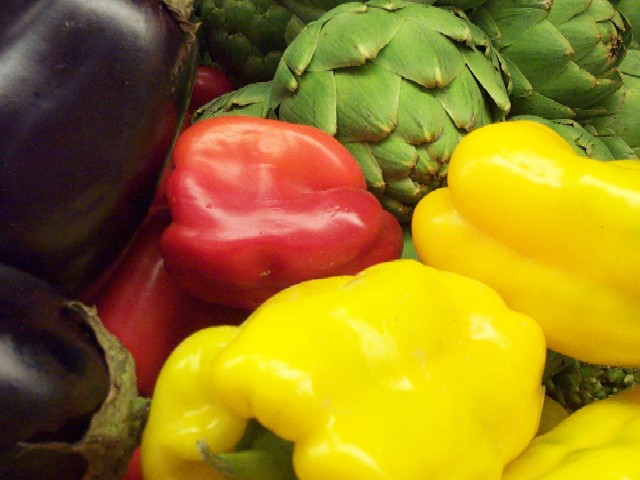
| Frontmost pepper is a little overexposed and blurry, imho. 5 sjgleah |
|
|
|
07/27/2002 10:15:00 PM |
| nice placement of red for focal point; slightly out of focus; |
|
|
|
07/27/2002 11:06:00 AM |
| You may want to try using a different application to resize your shots. This has many visible lines to it and takes away from your shot. The colors are nice but the eggplants are slightly dark for the border of one side. The texture really is mostly on the artichokes but there in the background of the shot. 5 |
|
|
|
07/27/2002 09:50:00 AM |
| Good use of primary colors. Depth of field can use improvement. |
|
|
|
07/26/2002 08:56:00 AM |
| nice colours, but composition could be better. |
|
|
|
07/25/2002 11:26:00 PM |
|
|
|
07/25/2002 01:42:00 PM |
| color looks a little flat, try adjusting the color balance to get more vibrent colors and increase the contrast some |
|
|
|
07/25/2002 01:42:00 PM |
| The bright yellow leads my eye right out of the picture. Seems to me the bottom center yellow pepper has been cropped too much; might have been better if it had been shown whole. The visual interest for me is on the artichokes but everything else is pulling my eyes away from them. |
|
|
|
07/25/2002 12:39:00 PM |
nice photo, but the lighting, to me, seems rather flat and uninteresting. also, it appears to be a bit soft overall, this could be your equipment and/or an intentional effect. if it is intentional, it doesn't work for me, i would like to see more sharpness, color, and contrast. (all of which can be achieved, with minimal effort, through a photo editing program like paintshop.) ~mcmurma
Aesthetics...5
Meets Challenge...5
Overall...5 |
|
|
|
07/25/2002 11:46:00 AM |
| i like these. they make me hungry. good framing and composition. succeeds. focus could be a little better on the foreground. |
|
|
|
07/24/2002 12:16:00 PM |
| i was toying with taking a fruit/vegetable kind of shot but ran out of time. good combination, too. colors, as well as texture. i know smooth is also a texture, but to me, the rough textures are much more interesting. therefore i would probably have placed the artichoke more in the foreground, and made the tops of the peppers and eggplant/aubergine more prominent, too. last but not least, check if you can save your photo with a larger files size (150k is allowed on this site) to avoid some of the pixelation that's visible. -- gr8photos (4) |
|
|
|
07/23/2002 11:55:00 PM |
| Very nice texture submission. I love the color texture also. The only suggestion I might make is that it might have been better if you had raised the bottom edge a little so as to leave out the pepper stem which is to me a little distracting. |
|
|
|
07/23/2002 07:00:00 PM |
| Your colors are so brilliant! I'm actually a bit visually overwhelmed by those yellow peppers, though. They seem to dominate the composition rather than fit into the scene. This gives the impression that you took it at the market, with all the other artichokes stacked in the background. Interesting idea. |
|
|
|
07/23/2002 04:23:00 PM |
Composition8,
Technical Aspects6,
Meets Challenge8,
Originality7,
Average Score7,
Autool.
|
|
|
|
07/23/2002 04:23:00 AM |
| size of shapes too similar for a satisfying composition? |
|
|
|
07/22/2002 10:42:00 PM |
| The colors are great, not too shiny. Looks like an ad in a magazine. |
|
|
|
07/22/2002 10:02:00 PM |
| Nice colors. I think mixing in some more textured veggies (or maybe rougher textured) in the mix would help. Maybe a brocolli (sp?) sprout instead of one of the yellow peppers. karmat |
|
|
|
07/22/2002 09:35:00 PM |
| I like the different textures of the different veggies. |
|
|
|
07/22/2002 06:51:00 PM |
| Great color. DOF is a bit off. Nice job though |
|
|
|
07/22/2002 05:10:00 PM |
| This looked good in the thumbnail and looks good full size too. Seems to me like a good candidate for a poster. The lighting is nice and bright, I think just a little flat so that we can't see the textrue of the yellow surface. The image is also just a bit soft. I believe that it would benifit from some unsharp mask. |
|
|
|
07/22/2002 02:13:00 PM |
|
|
|
07/22/2002 12:57:00 PM |
| nice shot, but you might want to try less compression (I hope it's not your camera) - get closer to the 150KB file size limit and you'll see the difference - I guess the yellow pepper in the foreground would profit most, its edges look funny like this. post on the forums or write me an e-mail if you don't know how to get better quality/less compression. 4 beegee |
|
|
|
07/22/2002 10:20:00 AM |
| Good clarity and an interesting variety of textures |
|
|
|
07/22/2002 10:14:00 AM |
| Wonderful colors, composition. The focus could of been better. Kee |
|
|
|
07/22/2002 04:02:00 AM |
|
Home -
Challenges -
Community -
League -
Photos -
Cameras -
Lenses -
Learn -
Help -
Terms of Use -
Privacy -
Top ^
DPChallenge, and website content and design, Copyright © 2001-2025 Challenging Technologies, LLC.
All digital photo copyrights belong to the photographers and may not be used without permission.
Current Server Time: 03/12/2025 02:49:37 PM EDT.