| Author | Thread |
Comments Made During the Challenge  |
|
|
07/27/2002 12:53:00 PM |
| Little dark and uninteresting in my opinion... Could use something else amidst the straw. 4 sjgleah |
|
|
|
07/27/2002 04:52:00 AM |
| A bit flat for me but good focus |
|
|
|
07/27/2002 02:57:00 AM |
| Nice color, random design. meets the criteria of the challenge, but it could have been a little more creative. |
|
|
|
07/25/2002 06:36:00 PM |
| This is very well in focus. I think a lower camera perspective would give it more depth, and it would also serve as a good background for something with a smooth texture and bright color. karmat |
|
|
|
07/25/2002 03:22:00 PM |
This is a fine photo of straw. It does fit the challenge, but there are few more considerations than just those two. Two more would be: Would I want this photo hanging on my wall? (nice/interesting to look at) Honestly no, I wouldn't. Second is my guess at your level of effort. Let's just say you creatively hid a message in the straw, like I love my wife, yada, yada, yada, whatever. From all appearances, you walked up to this patch of straw, and shot. Finally, the shot is a bit overly dark overall. If this was to convey some sort of message, I missed it.
5 Swash |
|
|
|
07/25/2002 01:11:00 PM |
| This is nice but lacks visual impact for me. It becomes a little monotonous and needed something else to give it tension or some juxtaposition. |
|
|
|
07/24/2002 04:37:00 PM |
Composition4
Originality6
Technical Aspects4
Meets Challenge5
Total Score5
For those that are just learning, like me.
Composition: Scoring in this area is based on basic composition of a picture and includes the rule of thirds, balance, cropping, and curved and diagonal lines. Subject matter that does not lend itself to the picture or otherwise unwanted is also considered here.
Originality: Scoring in this area is based on pictures or concepts that I have seen, as well as how much effort you have invested in the picture. Usually a little something that sets it aside from a snapshot. Does it make me want to come back for another look? You know things like that.
Technical Aspects: Focus, exposure, lighting, and other special effects (done by the camera), and post processing are all considered in this category.
Meets Challenge: This is based on my interpretation of if you, have/have not, met the challenge. This is fairly simple but quite important for this site.
There are many sites that can give you assistance in achieving better skills in photography, but I think the best way to learn is to take pictures and show them to other people. Believe me when it is a good one you will know it.
Good luck!
Autool
|
|
|
|
07/24/2002 07:57:00 AM |
| without a secondary light source, this potentially cool image falls flat. Spend a little more time with the lighting and angle. Drop something interesting in one corner and you'll have a nicer shot. |
|
|
|
07/23/2002 09:48:00 PM |
| i think a sideways light angle could haveb brought this texture more to life |
|
|
|
07/23/2002 02:36:00 PM |
|
|
|
07/23/2002 11:44:00 AM |
| Would have been nice to have some kind of contrasting color maybe |
|
|
|
07/23/2002 12:55:00 AM |
| Very jackson pollack meets jolly green giant. I love the muted colors in the straw and leaves! |
|
|
|
07/22/2002 10:03:00 PM |
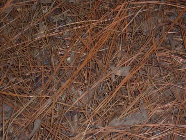
| I believe they're actually pine needles, aren't they? I think maybe some depth would help this picture a lot - a different perspective instead of straight down. |
|
|
|
07/22/2002 03:15:00 PM |
| straw and leaves, actually. while this meets the texture challenge, it's simply not a very interesting shot to me. there's no central point and it's too much tone in tone. sorry. -- gr8photos (2) |
|
|
|
07/22/2002 02:19:00 PM |
| I think I would have like to have seen more contrast in this photo. |
|
|
|
07/22/2002 06:17:00 AM |
| good texture, but the image is not inspiring me. = 4 - jmsetzler |
|
Home -
Challenges -
Community -
League -
Photos -
Cameras -
Lenses -
Learn -
Help -
Terms of Use -
Privacy -
Top ^
DPChallenge, and website content and design, Copyright © 2001-2025 Challenging Technologies, LLC.
All digital photo copyrights belong to the photographers and may not be used without permission.
Current Server Time: 03/12/2025 04:01:03 PM EDT.