| Author | Thread |
|
|
08/12/2002 10:14:00 AM |
| Hey Norm you did pretty good. I am happy for you. Well as soon as I get my camera back we will have to see who gets higher! Hillary |
|
Comments Made During the Challenge  |
|
|
08/11/2002 11:23:00 PM |
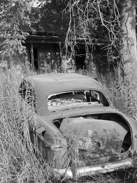
| This shot screams old, so well done there. I'm not sure why you chose to cut the right bumper from the framing, but I think maybe it should be included. |
|
|
|
08/11/2002 08:17:00 PM |
| Nice use of b&w. 6 sjgleah |
|
|
|
08/10/2002 01:40:00 PM |
| I like this but find the top half of the frame adds nothing (for me) and I'd look at what it's like cropped into a squarer shape, losing some of the top. |
|
|
|
08/09/2002 06:06:00 PM |
| Great shot of old. A nice combo shot with the car and house. Nice detail, nice shadows. I also like the position of the subjects, because the car leads your eyes back to the house. |
|
|
|
08/09/2002 01:40:00 PM |
| Great technical photo. Good subject. Excellent depiction of theme. |
|
|
|
08/09/2002 10:01:00 AM |
| good composition, nice title (to boot)... has depth. i.e. not just a photo of an old car. Tells a bit more story. Good work. |
|
|
|
08/09/2002 07:38:00 AM |
| Old and dusty. This would be grand-prize winner of the dusty catagory. |
|
|
|
08/08/2002 04:50:00 PM |
| nope, and nobody has been home in a while i think. nice find. what color was the car? would this have looked good in color, or maybe some color? i would like to see a little more contrast here. also, the title doesn't match the photo, the photo is really about the car, the title about the house in the background. -- gr8photos (5) |
|
|
|
08/08/2002 12:48:00 PM |
| this is neat :) I like the old feel here quite a bit... I believe that the exposure may be a little hot... maybe a touch more contrast or a small decrease in brightness would help out with that some :) - jmsetzler |
|
|
|
08/08/2002 11:03:00 AM |
| To me, an horizontal orientation would look better. |
|
|
|
08/08/2002 06:36:00 AM |
| This is a great shot. Lots of atmosphere, technically great and fits the challenge well. (9) |
|
|
|
08/07/2002 09:19:00 PM |
| Goes great with them and the black & white is perfect. |
|
|
|
08/07/2002 12:01:00 PM |
| great subject and use of greyscale |
|
|
|
08/07/2002 07:35:00 AM |
| Lots of car photos in this comp. but I like this one more than others. Very eye appealing. |
|
|
|
08/06/2002 09:15:00 PM |
| effective, b/w is actually well used here :) |
|
|
|
08/06/2002 05:28:00 PM |
| Good composition, and I like the vertical framing. Black and white works well here. karmat |
|
|
|
08/06/2002 02:46:00 PM |
|
|
|
08/06/2002 02:10:00 PM |
| This kind of works in b&w but it would be interesting to see it in color. While the car is mostly a darker shade of grey than the surrounding grasses they are kind of close. It does help that the house is mostly in shadow though and also that there are some shadow areas on the car itself. |
|
|
|
08/06/2002 10:18:00 AM |
| the b&w kills this picture |
|
|
|
08/05/2002 04:19:00 PM |
| I like this very much, and love the b&w. I find the composition to be very appealing. lhall |
|
|
|
08/05/2002 02:09:00 PM |
| Beautiful shot! This is exactly what I would have loved to have found for this challenge. Good job! |
|
|
|
08/05/2002 12:21:00 PM |
| I once saw the same exact old car. do ya live in California? |
|
|
|
08/05/2002 01:31:00 AM |
| Whow! Old car, old house, old tree. Triple whammy! |
|
Home -
Challenges -
Community -
League -
Photos -
Cameras -
Lenses -
Learn -
Help -
Terms of Use -
Privacy -
Top ^
DPChallenge, and website content and design, Copyright © 2001-2025 Challenging Technologies, LLC.
All digital photo copyrights belong to the photographers and may not be used without permission.
Current Server Time: 04/27/2025 02:45:20 AM EDT.