| Author | Thread |
Comments Made During the Challenge  |
|
|
08/18/2002 12:33:00 PM |
|
|
|
08/16/2002 05:07:00 AM |
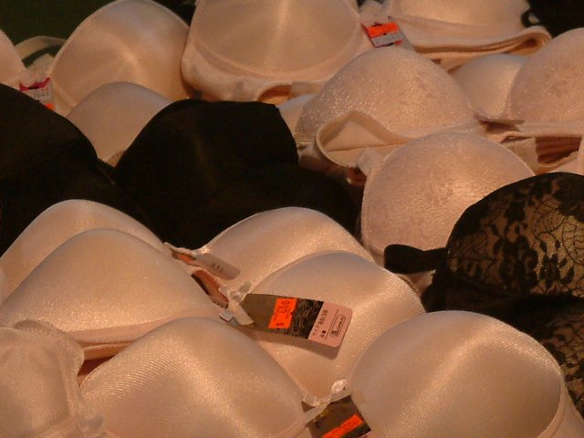
| like the idea, lighting is not very good though, you could have upped the contrast in Photoshop |
|
|
|
08/15/2002 07:09:00 PM |
| This made me smile, although I don't like to see the name of the challenge (new) used in the title... too cliche. The title would be effective just by dropping the word new. Unless the "forms" were in fact creamy colored, I think the photo could be lightened up some... on my computer anyway, it shows quite dark. Very original, though, and I like pictures with a sense of humor. |
|
|
|
08/15/2002 05:11:00 PM |
| hm. there's an interesting idea. definitely new and unique, but i'm not sure whether the random arrangement looks too exciting for me (and i understand you couldn't go into the store and rearrange their wares). how many comments did you get that there should be a naked woman inside one of them? ;) -- gr8photos (5) |
|
|
|
08/15/2002 01:54:00 PM |
| The orange color doesn't do anything for me |
|
|
|
08/14/2002 08:57:00 PM |
| So, the bras are new, I can make the connection. How come the lighting is so dim? |
|
|
|
08/14/2002 10:57:00 AM |
| Now this is a contribution. I gave u a 9 but wouldve given u a ten if they were full of breasts |
|
|
|
08/14/2002 10:32:00 AM |
Ho hum, well, all I can say is I'm glad you kept to the containers and not the contents :)
It's a great idea and decent shot, but the lighting seems a bit dark�
|
|
|
|
08/14/2002 12:31:00 AM |
| I'm crushed... this is the closest thing we got to nipples this week. I'm not sure I get the use of the word rosy in the title, but I think it has some reference to the shape of boobs. Think this would be a really cool "curves" entry. Would have like it better if it were a little clearer, at least so we could make out something on the tags. I see the "new" reference, pretty neat photo. Good luck with the challenge. |
|
|
|
08/13/2002 10:14:00 PM |
Something new.
Composition - pretty good
Technical Aspects - pretty good.
Meets Challenge - yes
Visual Impact / Originality � pretty good
Jim msp
|
|
|
|
08/13/2002 01:21:00 PM |
| Interesting. Seems a bit dark. Focus is good. 6 |
|
|
|
08/13/2002 09:20:00 AM |
| this is a neat photo, but the lighting and light color is a little weak... - jmsetzler |
|
|
|
08/12/2002 09:01:00 PM |
Composition4
Technical Aspects4
Appeal5
Creativity5
Rating5Autool
|
|
|
|
08/12/2002 08:07:00 PM |
| The bright orange tags take away...perhaps if you had tucked them under? Also if they were all laying flat and they same way it would have come across a bit better? |
|
|
|
08/12/2002 06:41:00 PM |
|
|
|
08/12/2002 06:28:00 PM |
| makes you think doesn't it |
|
|
|
08/12/2002 05:39:00 PM |
| I can only imagine the looks you got taking this picture ;) |
|
|
|
08/12/2002 02:46:00 PM |
| I'd love to know how the OTHER people in the store were looking at you when you took this picture! ha ha |
|
Home -
Challenges -
Community -
League -
Photos -
Cameras -
Lenses -
Learn -
Help -
Terms of Use -
Privacy -
Top ^
DPChallenge, and website content and design, Copyright © 2001-2025 Challenging Technologies, LLC.
All digital photo copyrights belong to the photographers and may not be used without permission.
Current Server Time: 03/13/2025 06:22:13 AM EDT.