| Author | Thread |
|
|
08/26/2002 12:59:00 AM |
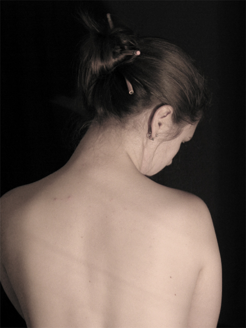
Well, I'm a little surprised that there were two photos so similar and one placed 14th while the other placed 91st. Just shows that the idea was very good, but the voters are very picky about lighting.
The shadows were caused by a very old desk lamp. It was either that or overhead lighting so...
Congratulations to everyone. There were some great shots in this challenge. I managed to pick 4 of the final 5. |
|
Comments Made During the Challenge  |
|
|
08/25/2002 06:39:00 PM |
| Perhaps my eyes are playing tricks on me, but I see a slight discoloration at the left side of the woman's head. Otherwise, great photo. |
|
 Photographer found comment helpful. Photographer found comment helpful. |
|
|
08/23/2002 01:12:00 PM |
| very nice composition... i like the use of the pencil in this shot quite a bit :) I believe the shadows that are traversing her back diagonally look slightly awkward... I'm not sure if there was a way to eliminate that or not... :) - jmsetzler |
|
| Photographer found comment helpful. |
|
|
08/23/2002 08:23:00 AM |
| Great concept and lovely light and colour. There are just a couple of lines across her back that are a little distracting. Lovely pose and framing, though. |
|
| Photographer found comment helpful. |
|
|
08/23/2002 07:14:00 AM |
I like this idea, but find the image a little too dark. I think it's the lighting. Would like more on the hair so can see the pencils and shapes and have more definition of the hair texture.
5, Kavey |
|
| Photographer found comment helpful. |
|
|
08/22/2002 10:13:00 AM |
| The stripes on the back are a little distracting, but otherwise this is beautiful. Maybe a tad more contrast. (Nice color tone, though!) |
|
| Photographer found comment helpful. |
|
|
08/21/2002 10:50:00 PM |
Composition - quite good
Technical Aspects - quite good
Meets Challenge - yes
Visual Impact / Originality � quite good
Other suggestions � stripes on back bother me here.
Jim msp
|
|
| Photographer found comment helpful. |
|
|
08/21/2002 07:30:00 PM |
From my perspective:
Meets challenge:Yes
Technical:ok
Appeal/Artistic:ok
Composition:ok
Comments:Good luck in the challenge.
|
|
|
|
08/21/2002 11:58:00 AM |
| This is a very nice photo. Well executed. My only 2 hangups would be the shadows on the back, and the cropped arm. Great use of pencils. Other than the shadows, the lighting is great and angle is also great. The pencils are subtle but definately there. Great job and good luck in the challenge. |
|
| Photographer found comment helpful. |
|
|
08/21/2002 10:33:00 AM |
| It's funny that this photo and the other one are so similar. I like them both about the same, although I think the more dramatic black and white of the other one appeals to me more. The subtelty of the lighting and sepia in this photo have their own charm, however. |
|
| Photographer found comment helpful. |
|
|
08/20/2002 10:14:00 PM |
| Somehow the pencil get lost in the beauty.......Wonder why? The photo quality is good but, this is a nice portrait shot. I would have liked more focus on the pencil, for this challenge, anyway. In an appropriate challenge I would go as high as 8 but since the challenge is about photographing a pencil I thik the pencil should be the heart of the picture. =6 syamjonimi ;'-) |
|
| Photographer found comment helpful. |
|
|
08/20/2002 07:20:00 PM |
Composition: Subject Placement, Cropping, Background7,
Technical: Focus, Exposure, Lighting, Processing6,
Challenge: Does your entry meet it?10,
Appeal: Is it Interesting, Motivating, Etc.? 6,
Total Averaged Rating7. Autool
|
|
| Photographer found comment helpful. |
|
|
08/20/2002 04:56:00 PM |
I love the coloring and shape of this photo. The way the background disappears is fantastic (and something I've not been able to do well....yet. 8) )
I think that I would have liked just a couple of subtle changes: the tilt of the head almost loses one of the pencils in the background....maybe a little more lighting at the top? I also wish that the the left shoulder was not cropped ...it kind of jars the great shape that you have going in the rest of the shot. And finally....I am trying to figure out what caused the shadowed lines across the back? Wrinkles in the diffuser or something? It's really not a big deal, but it is a little distracting.
Great shot, though....lovely! And an excellent idea to boot!
muckpond (your evil twin) :) |
|
| Photographer found comment helpful. |
|
|
08/20/2002 02:38:00 PM |
| I would like to see the rest of her shoulder & a little more light on her hair. nice job. 6 |
|
| Photographer found comment helpful. |
|
|
08/20/2002 06:31:00 AM |
| I like your shot very much, but would like to see more of the pencils, and have more lighting/focus on them. The pencils are in the shot, but the shot does not seem to be "about" the pencils. lhall |
|
| Photographer found comment helpful. |
|
|
08/20/2002 12:10:00 AM |
| Looks like a picture I already saw...is this a repeat? |
|
|
|
08/19/2002 11:39:00 PM |
| Since the pencils are sorta key to this challenge they should have been highlighted rather than being so obscured by darkness. I also don't like those two diagonal lines on the model's back; it makes it look, to me at least, like she had been engaged in some SM ritual. Don't know whether this was caused by the light or something else. The shadows also obscure the left side of the model in a somewhat awkward way. The lights and darks would have worked much better if the model's back would have been turned more at an angle from the camera. Journey |
|
| Photographer found comment helpful. |
|
|
08/19/2002 04:07:00 PM |
| Nice idea, could be better if it was a high-key foto. |
|
|
|
08/19/2002 02:37:00 PM |
| Good idea, just poor lighting..Score 6 ~Kee |
|
| Photographer found comment helpful. |
|
|
08/19/2002 02:17:00 PM |
"i need a picture of a pencil" to "i need a picture of you topless"
you must be very smooth
way to go nice shot |
|
|
|
08/19/2002 12:08:00 PM |
| Im not sure what pencils have to do with this other than a cheap reason to take a nude photo |
|
|
|
08/19/2002 11:16:00 AM |
| This is a wonderful shot. I love the tones and the neutral background. The pencil use is subtle, but it works� Good luck� |
|
| Photographer found comment helpful. |
|
|
08/19/2002 08:29:00 AM |
| Good shot, but a little too dark. |
|
| Photographer found comment helpful. |
|
|
08/19/2002 05:27:00 AM |
|
|
|
08/19/2002 02:37:00 AM |
| Concept: very good. Execution: could use a little help. Things that distracted me from your photo: her shoulder is cropped out, it appears accidentally -- I see no strong reason for it. The shadows across her back are distracting. Would have lined her chin up a bit more creating a nice line with her spine; it would also have been nice to see just down to the small of her back. The sepia tone is nice. 6 |
|
| Photographer found comment helpful. |
Home -
Challenges -
Community -
League -
Photos -
Cameras -
Lenses -
Learn -
Help -
Terms of Use -
Privacy -
Top ^
DPChallenge, and website content and design, Copyright © 2001-2025 Challenging Technologies, LLC.
All digital photo copyrights belong to the photographers and may not be used without permission.
Current Server Time: 03/12/2025 07:53:22 AM EDT.