| Author | Thread |
Comments Made During the Challenge  |
|
|
08/25/2002 05:38:00 PM |
| Nice smoke effect. Would have been even more if it was flipped up side down. |
|
|
|
08/24/2002 12:40:00 AM |
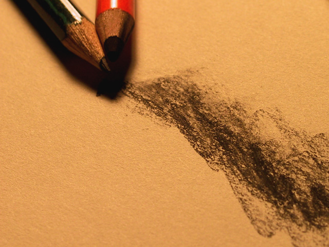
| I think the title gives this some kind of sexual reference. Makes a person wonder if that was the intent. This is a nice photo. The lighting is ok, but I think that the dark shadow near the tips of the pencils is just a bit too dark. it makes the red pencil almost look like it has no lead. The angle is good and the surface makes for a good skin tone color. Good job and good luck in the challenge. |
|
|
|
08/23/2002 01:27:00 PM |
| There seems to be a subtle relationship between these two. I like that a lot. I also really like the textures of the paper and charcoal, and the dark shadow. Very atmospheric. |
|
|
|
08/23/2002 07:10:00 AM |
I like this a lot, though find the shadow around the pencils just a little OTT. Love the texture of the scribble and the paper and the limited colours.
7, Kavey |
|
|
|
08/22/2002 10:12:00 AM |
| I think it's the color of the paper, but this image struck me as genitalia at first. |
|
|
|
08/22/2002 09:13:00 AM |
Composition: Subject Placement, Cropping, Background4,
Technical: Focus, Exposure, Lighting, Processing5,
Challenge: Does your entry meet it?10,
Appeal: Is it Interesting, Motivating, Etc.? 4,
Total Averaged Rating6. Autool
|
|
|
|
08/21/2002 03:52:00 PM |
| A very creative image, it will probably go underappreciated. |
|
|
|
08/21/2002 10:57:00 AM |
| Nice warm light but the shadows under the pencils lose the edges for us. Nice framing. |
|
|
|
08/21/2002 02:15:00 AM |
This is a nice start to the concept of this pic.
I feel cut off somehow from the wider view of something more.
My eye seeks a more wider view... |
|
|
|
08/20/2002 07:44:00 PM |
|
|
|
08/20/2002 11:25:00 AM |
| I love the concept of this photo... artistically and compositionally, it's very nice :) I'm not sure if the yellow tint is the natural paper color, but I would like a white a little better here... if the paper was white, the white balance settings on your camera may help out some :) Good shot... - jmsetzler |
|
|
|
08/19/2002 11:35:00 PM |
| Pity that the two pencils aren't very sharp since they are the focal point of the image. I presume it's the result of the quality of your camera. Since there are so few elements on this picture, every detail counts. I find therefore the color selection of the two pencils on the yellow background not the happiest. Journey |
|
|
|
08/19/2002 09:43:00 PM |
| very hard shadow under the pencils which could do with some reflected light. Also has a very orange colour cast from the lighting which you could maybe fix with either white balance controls or later in a editing program ? |
|
|
|
08/19/2002 02:32:00 PM |
| where's roy dale might know |
|
|
|
08/19/2002 12:56:00 PM |
I like the picture. I would have prefer it to be more 'white' than yellow/brown. I think I would have prefer as well to have everything in focus, the pencils as well.
5 |
|
|
|
08/19/2002 05:58:00 AM |
| Meets the challenge. Technically well done, but the image seems a little too darkâ€Â¦ |
|
Home -
Challenges -
Community -
League -
Photos -
Cameras -
Lenses -
Learn -
Help -
Terms of Use -
Privacy -
Top ^
DPChallenge, and website content and design, Copyright © 2001-2025 Challenging Technologies, LLC.
All digital photo copyrights belong to the photographers and may not be used without permission.
Current Server Time: 03/12/2025 01:56:22 AM EDT.