| Author | Thread |
Comments Made During the Challenge  |
|
|
09/22/2002 07:07:00 PM |
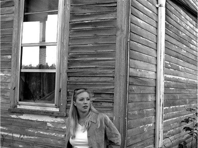
There is detail everywhere. I don't see this as a good example of negative space.
T |
|
|
|
09/22/2002 01:38:00 AM |
Lonley is spelled like this LONELY!!!
Sorry |
|
|
|
09/20/2002 03:58:00 PM |
| I think I would like this better if it weren't for the window. I like the bw here. karmat |
|
|
|
09/20/2002 01:54:00 PM |
| sorry, there is no neg space here |
|
|
|
09/20/2002 12:42:00 PM |
|
|
|
09/18/2002 08:18:00 PM |
|
|
|
09/18/2002 03:40:00 PM |
| Negative space being the house, subject the girl. I like the use of black and white here. The old house and the young woman contrast nicely. lighting was really nice for the photo, and angle and framing are good. overall nice photo. good luck in the challenge. 6 ~hbunch7187~ |
|
|
|
09/17/2002 02:35:00 PM |
| Lovely girl ! No sure though that the surrounding really helps to focus on her. It might just be too cluttered to become positive space :-( . I would have taken her (I mean photography here) against the right wall, more close up. What do you think ? 6. marcvg |
|
|
|
09/17/2002 10:16:00 AM |
| Pretty good. Would like to see a more candid look, but I am still pleased by this one. 7 |
|
|
|
09/16/2002 11:45:00 PM |
| I think I would have perferred this one in color. Good shot though.5 |
|
|
|
09/16/2002 11:28:00 PM |
| I'll bet she's NOT that lonely.... Nice job |
|
|
|
09/16/2002 10:30:00 PM |
| I really like this picture... 8 Frank, I may change it to a 10 if I can determine that it is good use of negative space.. |
|
|
|
09/16/2002 04:59:00 PM |
| i'm sorry, in my opinion, this photo does not really use negative space. yes, the girl is small in comparison to the house, but there's the wood texture, and the window, plus the plants also fighting for my attention. this may have been increased because everything is b&w, of course i don't know what color the house was. -- gr8photos. |
|
|
|
09/16/2002 10:39:00 AM |
| Wonderful tones, girl, expression, light, building. I don't like the reflection in the window it's distracting to me. Also the shot is tilted a bit. Score 6 Justine |
|
|
|
09/16/2002 06:58:00 AM |
Composition: 5
Lighting: 5,
Appeal: 5, Total Rating 5 Sulamk
|
|
|
|
09/16/2002 02:11:00 AM |
| this photo is alright, but I focused on the building more than the girl. |
|
|
|
09/16/2002 12:51:00 AM |
| I don't see how the background enhances the subject in this photograph. |
|
Home -
Challenges -
Community -
League -
Photos -
Cameras -
Lenses -
Learn -
Help -
Terms of Use -
Privacy -
Top ^
DPChallenge, and website content and design, Copyright © 2001-2025 Challenging Technologies, LLC.
All digital photo copyrights belong to the photographers and may not be used without permission.
Current Server Time: 03/12/2025 02:35:17 AM EDT.