| Author | Thread |
|
|
11/03/2002 12:09:00 PM |
afterthought: a bit soft. did u handhold this?
|
|
 Photographer found comment helpful. Photographer found comment helpful. |
Comments Made During the Challenge  |
|
|
10/27/2002 08:38:00 PM |
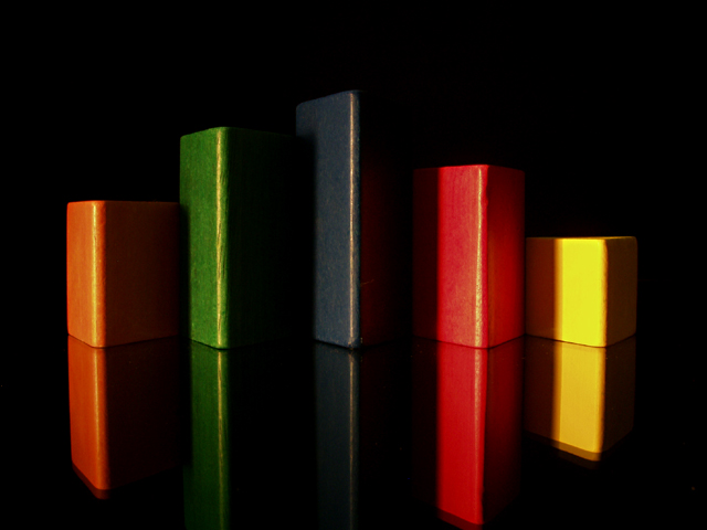
| You�ve made this look wonderfully simple, (Less is More). The rich color in concert with the dark background are executed perfectly here. The shapes and angle, good choice. The lighting is soft and the highlights show the detail in the wood without excessive glare. The reflective surface it a nice touch. Good Luck, I hope you do well with it. Gotcha - 9 |
|
| Photographer found comment helpful. |
|
|
10/27/2002 06:56:00 PM |
| Really nice keeping symmetry but with different colour. I like the reflections too, and the lighting really brings out the shapes. 10 - Konador |
|
| Photographer found comment helpful. |
|
|
10/27/2002 03:25:00 PM |
| Reflections without mirrors |
|
|
|
10/26/2002 01:15:00 PM |
| Great use of light/shadow/colour/reflection. |
|
| Photographer found comment helpful. |
|
|
10/26/2002 01:12:00 PM |
| nice graphic image. i like the strong lines and bold colors, and the reflections add a nice touch as well. ~mcmurma |
|
| Photographer found comment helpful. |
|
|
10/24/2002 10:04:00 PM |
|
| Photographer found comment helpful. |
|
|
10/24/2002 08:17:00 PM |
| excellant. Only question is why is the yellow not spaced like the others? |
|
| Photographer found comment helpful. |
|
|
10/24/2002 12:09:00 AM |
| This would have also been a nice reflection shot... Great job! 10 smshats |
|
|
|
10/23/2002 10:21:00 PM |
| I like the colors playing off of the negative space. The reflection, and I think it is much more interesting with the reflections than it would have been without them. lhall |
|
| Photographer found comment helpful. |
|
|
10/23/2002 10:00:00 PM |
|
|
|
10/23/2002 05:10:00 PM |
| Pretty good reflections of the reds and yellow. Don't quite buy the placements though - reason for putting 2 together and the rest apart? |
|
| Photographer found comment helpful. |
|
|
10/23/2002 02:28:00 PM |
| Great crisp and clear colors. I like the "symmetry" that is portrayed, and the reflections are awesome. The eye if really drawn upward in this picture. -3 karmat |
|
| Photographer found comment helpful. |
|
|
10/22/2002 10:58:00 AM |
| like the reflections. a bit tight on the blue reflection though |
|
| Photographer found comment helpful. |
|
|
10/22/2002 08:36:00 AM |
| excellent shot... the composition here is great and I love the reflections... critique: the only thing I would have probalby attempted differently in this shot would have been to replace that yellow block with something less reflective. The yellow is reflecting much more of your light source and it's exposure level is a LOT hotter than the rest of the blocks. Instead of having a smooth eye transition across this photo, the eye is immediately drawn directly to the right side of the image. A good photogrpahy guideline is that your photo reads like a book... top down and left to right... (guideline, not rule!) Metering and evenly exposing a photo like this is difficult, but you have done a good job. Another note... did you look at this photo rotated 180°? Good work :) - setzler |
|
| Photographer found comment helpful. |
|
|
10/21/2002 10:13:00 PM |
| I really like this. The colors and lines are cool. Nice use of lighting. I'd prefer to have the "top" of the reflections in the shot tho. Also, why is there a double edge on the reflections? It looks like a movement blur and tricks my eyes. Very strange ;o) ~indi |
|
| Photographer found comment helpful. |
|
|
10/21/2002 08:13:00 PM |
| Very nice shot ... I like the colors shapes. dramatic effect : medium. 7 Lionel |
|
| Photographer found comment helpful. |
|
|
10/21/2002 03:38:00 PM |
| uninspiring. nice reflections. 4 |
|
| Photographer found comment helpful. |
|
|
10/21/2002 01:28:00 PM |
| Yep- A simple image is often the best - very nice. |
|
|
|
10/21/2002 01:04:00 PM |
| love it. great design : ) mag99 |
|
| Photographer found comment helpful. |
|
|
10/21/2002 11:41:00 AM |
| nice job with the darkness but still reflection color just adds to the image--9bobgaither |
|
| Photographer found comment helpful. |
|
|
10/21/2002 02:27:00 AM |
| Nice shot! The reflections work really well for this shot. The objects are properly centered, and not tilted... - 7 - JB |
|
| Photographer found comment helpful. |
|
|
10/21/2002 01:46:00 AM |
| Simple and good. I really like the angle and framing/cropping you have chosen for this. The reflections are really nice, and your light source is also great. Love the effect it has on these blocks. Having a 2 year old, we have these everywhere. LOL. Nice shot. Good luck in the challenge. ~Hbunch7187~ |
|
| Photographer found comment helpful. |
Home -
Challenges -
Community -
League -
Photos -
Cameras -
Lenses -
Learn -
Help -
Terms of Use -
Privacy -
Top ^
DPChallenge, and website content and design, Copyright © 2001-2025 Challenging Technologies, LLC.
All digital photo copyrights belong to the photographers and may not be used without permission.
Current Server Time: 03/13/2025 03:44:47 PM EDT.