| Author | Thread |
Comments Made During the Challenge  |
|
|
11/10/2002 08:16:00 PM |
| Good composition. Good focus and color. Meets the challange. |
|
|
|
11/10/2002 06:31:00 PM |
|
|
|
11/10/2002 06:52:00 AM |
|
|
|
11/09/2002 10:35:00 PM |
| Just as a side note, it's spelled "defense" |
|
|
|
11/08/2002 09:13:00 AM |
| i LOVE this concept. the lighting could have been done a lot more interestingly, though. mag99 |
|
|
|
11/08/2002 08:32:00 AM |
| a spelling review might help as much as your obvious creativity |
|
|
|
11/08/2002 05:13:00 AM |
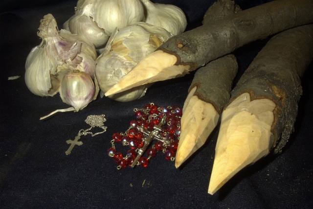
Since when has 'Buffy the Vampire Slayer' been an Urban Legend?
Could have done with a little less empty space (especially at the left) but otherwise I like it. |
|
|
|
11/07/2002 06:07:00 PM |
i'm sure people already told you about the typo in the title, good thing this isn't a title contest ;)
challenge -- met. great idea. i'm sure most people will get this one.
technical -- well done. little glare on the garlic is totally acceptable, colors are nice.
composition -- not totally sure about the arrangement. the cross on the beaded chain is barely visible. i also don't think the red beads fit in here (the color). not y sure how i would rearrange (sorry, i know i'm not helping you there, but i wanted to at least leave you my impression).
-- gr8photos |
|
|
|
11/06/2002 11:14:00 PM |
| They obviously work against the spirit of out of focus and off color and messed up background. If you want to get really technical I only see 3 very small problems: a little piece of loose garlic skin in the left midway up edge, something on the table just to the right front of the crucifix, and white shaving dots to the right of the stakes. a total of about 1.5 points off and a 10 for the challenge. That gives you. Can't complain about an 8 |
|
|
|
11/06/2002 02:00:00 PM |
| Cool composition. I think a brighter or lighter background, and a touch more contrast would help it overall. nice work though. karmat |
|
|
|
11/05/2002 03:50:00 PM |
| would've liked some lighting that wasn't a flash, maybe candles.... these items would look a lot spookier if they weren't so overtly lit. |
|
|
|
11/05/2002 09:59:00 AM |
| Good set of props and a clever title. |
|
|
|
11/04/2002 11:44:00 PM |
| lighting from the other direction would be much better.. and less contrived looking |
|
|
|
11/04/2002 11:29:00 PM |
| Creative thinking! Wish the shot was a bit brighter, though. |
|
|
|
11/04/2002 05:47:00 PM |
| If this doesn't kill the baddies, I don't know what would :-). Good composition and lighting. DOF is good. |
|
|
|
11/04/2002 02:50:00 PM |
| Nice looking garlic! This shot is nicely done. I'm only picking on the lighting. It should be moody which you have done, but IMHO .....it needed to be a bit lighter. Over-all I really think it's a good job. Justine 7 |
|
|
|
11/04/2002 09:44:00 AM |
| nice to see some effort had gone into the shot.. could of been a little brighter maybe? 7 asaberi |
|
|
|
11/04/2002 09:39:00 AM |
| Nice creativity and thought, the photos clarity, in my opinion, is great as well. |
|
|
|
11/04/2002 12:37:00 AM |
| Just a few things that you had laying by your bed? Good idea. To make it even better you might have cleaned up your background a bit from the bark and garlic skin. Very nice though. DPz |
|
Home -
Challenges -
Community -
League -
Photos -
Cameras -
Lenses -
Learn -
Help -
Terms of Use -
Privacy -
Top ^
DPChallenge, and website content and design, Copyright © 2001-2025 Challenging Technologies, LLC.
All digital photo copyrights belong to the photographers and may not be used without permission.
Current Server Time: 03/12/2025 06:40:45 PM EDT.