| Author | Thread |
Comments Made During the Challenge  |
|
|
12/01/2002 07:01:00 PM |
|
|
|
12/01/2002 06:46:00 PM |
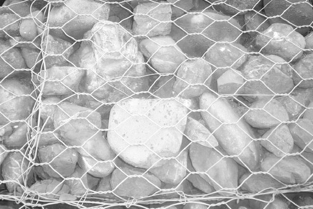
| B&W worked against you here - it's so grey it is almost faded into one solid rock. Needed to be in color, and or darker to bring out the individual "pets". PTL3 |
|
|
|
11/30/2002 07:48:00 PM |
| You have a great sense of humor. |
|
|
|
11/29/2002 07:26:00 PM |
| I don't see a story behind this picture. The picture is to bright and not very well focused. |
|
|
|
11/28/2002 04:51:00 PM |
| Very creative, and the black and white was a good choice. |
|
|
|
11/28/2002 12:44:00 PM |
| It made me laugh. Great imagination. My wife and I had an argument whether this met the challenge. She said no. I said yes. I'm casting the vote. |
|
|
|
11/27/2002 09:22:00 PM |
| Oh, the humor kills me :-) A touch washed out in the center. 7 nards656 |
|
|
|
11/27/2002 01:40:00 AM |
|
|
|
11/26/2002 10:16:00 PM |
| Over exposed center rock, and featureless background don't help this at all. |
|
|
|
11/26/2002 06:48:00 PM |
|
|
|
11/26/2002 02:48:00 PM |
| You know, my first reaction was that this needs more contrast, however, My shot is similar to this, as I have NEVER seen a photo look the same after it's transfered into print for a newspaper. They are always grey, right? I'm getting marked down a LOT for my decision to make the shot look like a REAL newspaper shot, and I wont do that to you. :) However, there do seem to be a few bright spots onthe rocks. Otherwise, nice angle and framing/cropping, and focus seems nice as well. Good luck. ~HBunch7187~ |
|
|
|
11/26/2002 02:20:00 PM |
| Heh...It's mildly amusing but only because of the title. The overly white rock in the front is the eye catching point which overpowers the rest of the rocks. |
|
|
|
11/26/2002 02:12:00 PM |
| I've seen these... with the pet rock prison signs and everything... very cute. The picture, however, seems pretty washed out. |
|
|
|
11/26/2002 02:10:00 PM |
| cute idea... the conrast in this photo is weak... maybe less light or a different angle would be an improvement :) - setzler |
|
|
|
11/25/2002 07:55:00 PM |
| humorous premise, but fuzzy and very overexposed |
|
|
|
11/25/2002 06:10:00 PM |
| I have to vote for this one just because anything that can make me laugh has to be funny... |
|
|
|
11/25/2002 04:38:00 PM |
|
|
|
11/25/2002 04:21:00 PM |
| LOL Fun shot. Maybe a bit over exposed....? Flash? Fun work. Justine |
|
|
|
11/25/2002 02:43:00 PM |
| really great idea... but perhaps a bit overexposed (just my opinion)...what do you think about literal signs of protest too? ....6 bullwinkle |
|
|
|
11/25/2002 10:48:00 AM |
Composition: Subject Placement, Cropping, Background8,
Technical: Focus, Exposure, Lighting, Processing5,
Appeal: Is it Interesting, Motivating, Etc.? 6,
Total Averaged Rating6. Autool
IMO the relationship between the title and picture are key elements in this challenge. this is way too funny. Where is your contrast?
|
|
|
|
11/25/2002 05:38:00 AM |
| Your title made me chuckle. :) |
|
Home -
Challenges -
Community -
League -
Photos -
Cameras -
Lenses -
Learn -
Help -
Terms of Use -
Privacy -
Top ^
DPChallenge, and website content and design, Copyright © 2001-2025 Challenging Technologies, LLC.
All digital photo copyrights belong to the photographers and may not be used without permission.
Current Server Time: 04/27/2025 02:55:19 PM EDT.