| Image |
Comment |
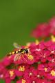
| 06/17/2003 02:32:16 PM |
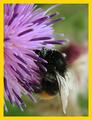
National Geographic (Holland Edition)by KINGComment: Pretty flower and a nice bee shot. Love the pollen in it's "hair". DOF is a little narrow, but this close...it's going to be. Still, I'd like the wings a bit more visible. This is an interesting angle, but hard on the far wing. 9 Rob the Swash |
 Photographer found comment helpful. Photographer found comment helpful. |
| 06/17/2003 02:30:00 PM |
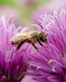
DISCOVER "Killer Bees"by severinComment: Very nice shot! Vivid colors!!!! Sharp on the bee. A little too much light on the wings, but that's picking nit. Very good details. 9 Rob the Swash |
| Photographer found comment helpful. |
| 06/17/2003 02:28:31 PM |
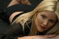
Vogueby danh669Comment: Looks like a Vogue cover to me! Pretty model. Well taken photo, with a tiny, personal nit - I'd like to see a little more light on her face, esp. the right side. Very pretty model!!! 9 Rob the Swash |
| Photographer found comment helpful. |
| 06/17/2003 02:26:53 PM |
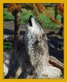
National Geographic-Wolves in Captivityby sagestudioComment: ???? Why wouldn't this be valid???? Very nice shot! Border color is a might bit off (too tan), but that's picking nit, really!!! I could wish the fence wouldn't be there, but that's asking for too much! Overall a cool shot! I like it! 9 Rob the Swash |
| Photographer found comment helpful. |
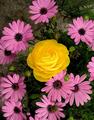
| 06/17/2003 02:22:53 PM |
Better Gardensby pitsamanComment: Pretty, contrasting flowers. Very nice color. Lighting - just a touch dark overall, but much lighter would have made the yellow a bit too harsh. Nice image.
9 Rob the Swash |
| Photographer found comment helpful. |
| 06/17/2003 02:21:26 PM |
National Geographicby InnaNComment: Very nice image. Seems like a NG cover to me! Color seems a little low (increase the saturation a touch or two), but not bad. Focus seems pretty good. Compositionally - I think I've seen NG covers that looked pretty near to this, good work!!! 9 Rob the Swash |
| Photographer found comment helpful. |
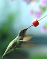
| 06/17/2003 02:19:31 PM |
NATIONAL GEOGRAPHICby MorganComment: Cute shot, love the tongue! I'll bet you're getting heck over the sqareness of your image! (I feel for you!!!) Very strong image with very good details. Color seems very good. (Are you getting comments about the border being distracting or off color - if so...don't sweat it - it's not the photo, which is magnificent! 9 Rob the Swash |
| Photographer found comment helpful. |
| 06/17/2003 02:17:04 PM |
Virginia Wildlife Magazineby FranziskaLangComment: Neat shot of the hoverfly. A little wider DOF might have been good as the tail and far wing are out of the range quite a bit. The main body seems pretty good, but even the front of the face seems a bit off. Overall, a very high impact photo and I like it! 9 Rob the Swash |
| Photographer found comment helpful. |
| 06/17/2003 02:14:46 PM |
Birds and Bloomsby MarjoComment: Works pretty good for me. I like the wing blur, stopping that blur is very hard with a digicam. The glare on the back is a might harsh, but overall, I like this very much. Too bad she wasn't up to a real flower, but that's just picking nit. I've tried to get into Birds and Blooms, it's very hard...this picture would be close, I think.
9 Rob the Swash |
| Photographer found comment helpful. |
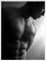
| 06/17/2003 02:12:05 PM |
Male Fitnessby imagesloyolaComment: Nice shot for B&W. Very good subject for title (well defined). I'm a little torn on the crop in the face (a little more - a little less maybe? I dunno) The glare spot on the wall is a tad too strong (IMO). Still very representative - 9 Rob the Swash |
| Photographer found comment helpful. |
Home -
Challenges -
Community -
League -
Photos -
Cameras -
Lenses -
Learn -
Help -
Terms of Use -
Privacy -
Top ^
DPChallenge, and website content and design, Copyright © 2001-2025 Challenging Technologies, LLC.
All digital photo copyrights belong to the photographers and may not be used without permission.
Current Server Time: 04/18/2025 04:14:01 AM EDT.