| Image |
Comment |
| 04/27/2006 03:08:32 AM |
Backyard viewby srdanzComment: Fits challenge=5
Color/lighting=0
DOF/focus=1
Wow factor/uniqueness=1
Attractiveness=1
While I like this setup with the windows open and the long exposure, I do feel that the colors could use a little boost in saturation. I don't think much of one but does seem to need something. |
 Photographer found comment helpful. Photographer found comment helpful. |
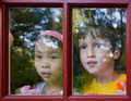
| 04/27/2006 03:06:19 AM |
It stopped raining!by scarbrdComment: Fits challenge=5
Color/lighting=1
DOF/focus=1
Wow factor/uniqueness=0
Attractiveness=1
cute image with great expressions, the smudges under the girls nose is distracting and looks like a mustache. At first I wondered how a polarizer would help loose some of the reflection but now I think you need it, it adds to the image. Good job. |
| Photographer found comment helpful. |
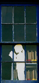
| 04/27/2006 03:04:01 AM |
Attic Readerby PhotoRynoComment: Fits challenge=5
Color/lighting=1
DOF/focus=1
Wow factor/uniqueness=0
Attractiveness=1
nice, I love the old windows and how you composed it. Good luck |
| Photographer found comment helpful. |
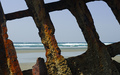
| 04/27/2006 03:02:13 AM |
Room with a Viewby talmyComment: Fits challenge=5
Color/lighting=1
DOF/focus=0
Wow factor/uniqueness=0
Attractiveness=0
Not your typical window but very nice and creative...old ship? A part of me wishes that small uprising towards the bottom center/left was gone but really just a minor flaw. |
| Photographer found comment helpful. |
| 04/27/2006 03:00:42 AM |
Spring Peaceby vtruanComment: Fits challenge=5
Color/lighting=0
DOF/focus=1
Wow factor/uniqueness=0
Attractiveness=0
Kind of hard to tell it is taken through a window, I personally am looking for a window to be framing the object as I think this is what the challenge details were about, I will give you the benefit of the doubt. Good focus and depth of field, keeping the background at just enough blur to add a little color and character. |
| Photographer found comment helpful. |
| 04/27/2006 02:58:35 AM |
the spyby gastonComment: Fits challenge=5
Color/lighting=1
DOF/focus=1
Wow factor/uniqueness=1
Attractiveness=1
I like the depth of this image and the colors are nice but not too much to distract the viewer from seeing the subject and even the background. Nicely done. |
| Photographer found comment helpful. |
| 04/19/2006 04:25:34 PM |
"Reflection From The Past"by f-Stop1Comment: Originally posted by f-Stop1:
First, I would like to thank all �10� who ambitiously left comments!!! Thank you very much!!!!
My concerns are the 242 that did not comment! Why?...Again, I ask, why? Why so few?... |
I really think that most feel it is too much effort, heck this is the first challenge I voted on in months. When there are lots of images to vote on most would rather just get all voted on and only comment on the ones they feel deserve their attention...(I'm betting that those are also the ones that are good enough that they don't need comments at all). There are a few rare people that feel like you do, that learning is the key to this site and comments rather than votes are usually more useful.
Keep your chin up and learn what you can from the little you get. |
| Photographer found comment helpful. |
| 04/17/2006 01:35:16 PM |
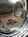
Chrome Logoby TullyComment: Fits challenge=5
Color/lighting=1
DOF/focus=1
Wow factor/uniqueness=1
Attractiveness=1
Cool! I like the placement and idea but have a few suggestions. You can see water spots in the logo, maybe could be dried more to get it cleaner. I wonder what it would look like if you desaturate the blue only and make the chrome really pop while still keeping the other colors...just a thought, already a cool image. |
| Photographer found comment helpful. |
| 04/17/2006 01:34:25 PM |
"untitled 11175" 01.45hrs CHby renefunkComment: Fits challenge=5
Color/lighting=1
DOF/focus=1
Wow factor/uniqueness=1
Attractiveness=1
wow this one's seen some rough times (pun on purpose) huh. Nicely done. I like the subtle hints of color (I wonder if you could desat the green to make it only have the red). Image is slightly smaller than the normal submission but not on a scale that hurts it really. |
| Photographer found comment helpful. |
| 04/16/2006 03:06:35 PM |
Untitledby OriontjComment: Fits challenge=5
Color/lighting=0
DOF/focus=1
Wow factor/uniqueness=0
Attractiveness=0
I think you could have done a couple simple things to avoid this looking like a traditional snap shot... Get rid of some of your brightness, if you can't move the bike to another location then maybe find a way to shield it, your chrome is blown out to the point of being a distraction. I think the rim itself would have been more interesting shot at the right angle.
Your colors are a little plain and dull, see if you can adjust the curves a little or maybe your brightness and contrast to make this image stand out more.
While your image isn't really too small, it is well below the recommended submission sizes so you had room to grow. Try and use the full size allowed
to maybe give more to look at or at least a larger image to appreciate.
Hope this helps. |
| Photographer found comment helpful. |
Home -
Challenges -
Community -
League -
Photos -
Cameras -
Lenses -
Learn -
Help -
Terms of Use -
Privacy -
Top ^
DPChallenge, and website content and design, Copyright © 2001-2025 Challenging Technologies, LLC.
All digital photo copyrights belong to the photographers and may not be used without permission.
Current Server Time: 04/22/2025 03:19:56 PM EDT.