| Image |
Comment |
| 04/27/2005 05:03:12 PM |
Riverside Laundryby desertdocComment: Lose the border. I guess the intention subject is obviously the people doing laundry, which, if you hadn't told me so, I wouldn't have a clue. It's a good thing that the women is wearing a bright colour, otherwise, the tree would dominate the photo, which it is also almost doing right now, and then this wouldn't be minimalism. I don't think I like this one. I like the idea, but a flat horizon, or a single-sbject that is stronger in the frame than the one here, would suit the idea better, i think. 4 |
 Photographer found comment helpful. Photographer found comment helpful. |
| 04/27/2005 04:59:04 PM |
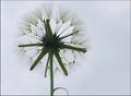
Lonely Daisyby MudHutComment: A little on the cliché side, but as well, a good representation of a cliché. greener grass would be nice. 6 |
| Photographer found comment helpful. |
| 04/27/2005 04:58:05 PM |
My Little Sushiby rlinn3Comment: Nice comp. but I think shooting the sushi not directy at the light source would eliminate the small glare the the white parts of the fish reflect. nice. 5 |
| Photographer found comment helpful. |
| 04/27/2005 04:56:50 PM |
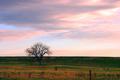
Standing Strongby beamsclanComment: Nice, it would be better if the clouds were not so dark, because they almost act as a second subject, and detract the attention away from the tree. Maybe a smaller crop to eliminate the grass on the left side as well would be good. A little too dark shadows and a little to light highlights. Needs less contrast perhaps. Good try though, 4 |
| Photographer found comment helpful. |
| 04/27/2005 04:54:17 PM |
|
| Photographer found comment helpful. |
| 04/27/2005 04:50:35 PM |
Daddy's Sonby davidphotographyComment: Cute, but struggles to meet the challenge. Perhaps if one eye was open, and the title suggests that the eye was the focus. A little too blurry as well, for me. 2 |
| Photographer found comment helpful. |
| 04/27/2005 04:49:27 PM |
the Old Padlock.by kiwinickComment: Nice 'old-barn-red' colour, however, the careless paint job detracts from the subject. 3 |
| Photographer found comment helpful. |
| 04/27/2005 04:48:35 PM |
My Babyby BigHusker001Comment: Perhaps the subject is too big in the frame, and doesn't meet the challenge, but I guess the idea of minimalism can be debated. 4 |
| Photographer found comment helpful. |
| 04/27/2005 04:47:38 PM |
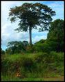
Forest of Oneby pumaComment: Nice, it would be better if the whole tree was against the sky though, nice colours too. 7 |
| Photographer found comment helpful. |
| 04/24/2005 10:58:16 PM |
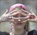
gypsy windby SeanachaiComment: Very Nice, I like the fact that there isn't another one of these in this challenge. The Eyes really stand you, and why shouldn't they. Beautiful. |
| Photographer found comment helpful. |
Home -
Challenges -
Community -
League -
Photos -
Cameras -
Lenses -
Learn -
Help -
Terms of Use -
Privacy -
Top ^
DPChallenge, and website content and design, Copyright © 2001-2025 Challenging Technologies, LLC.
All digital photo copyrights belong to the photographers and may not be used without permission.
Current Server Time: 03/12/2025 03:07:34 PM EDT.