| Image |
Comment |
| 11/29/2002 05:32:00 AM |
Over the Top.... !!Touchdown!!by risu81Comment: Great seats buddy!! Nothing is truly in focus in this frame which is really a shame. It is a great op for a pic being on the goalline and all and taken from pretty close. I don't know if all the zoom had a hand in making this a blurry shot, but something did and its unfortunate. I couldn't say enough about the composition of his pic. In crisp focus, prolly a 9 minimum. - Inspzil |
 Photographer found comment helpful. Photographer found comment helpful. |
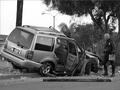
| 11/29/2002 05:29:00 AM |
Don't Drink and Drive by byetkoComment: The cop makes this picture really newsworthy. Framing is good. I like the greyscale approach as well. Nice capture. Unfortunate accident. - Inspzil |
| Photographer found comment helpful. |
| 12/03/2002 11:52:00 PM |
21 Years in Lafayette Parkby iraeComment: Composition - First off, this is definitely a challenge worthy picture. My initial impression of this picture is that there is too much stuff in this picture. It makes the shot seem too cluttered. Taking the shot at an angle might conserve a little room on either side of the signs where we could still see some of what is on the signs. I really don't like the "head on" angle though. The woman in the hut is a little dark too. If she is the main subject in this picture I think she should stand out a little more and not be hiding in the shadows. The shadow on the right sign is also a little distracting. Background - I love the guy on the horse statue in the background. It really gives the sense of where this woman is more than anything else in the picture. The buildings in the back look great and the sky has very good color. Camera work - Not much to note in this section. The biggest thing is overcoming the woman's dark face. I was thinking that maybe a little fill flash might help that out and wash away a little of the shadow on the right sign. You did a really good job with the general exposure, DOF, and focus. Post-processing - I don't see anything that would indicate a problem with the processing. The colors are probably a little saturated, but that goes a long way when a picture is properly taken. Overall - This woman has unmatched perseverence judging from this pic. I don't know of anything I feel THIS strongly about with the exception of my family. I think changing the angle of the shot would be the most beneficial advice I could give. It lacks some of the real emotive mood that a different angle might be able to bring. Getting the subject to more available light or breakin' out the flash would've helped some too. Hope this helps a little - Bob (Inspzil) |
| Photographer found comment helpful. |
| 11/29/2002 05:00:00 AM |
Sharing Is Caringby indigo997Comment: Adorable shot of admirable work. I'm glad he got some recognition on this shot. I could see this pic in the paper. It is well framed. i really like his expression and he's 'in action'. The only thing that would make this better is a contributor putting a little money in the bucket. This is a nice representation of people helping the community, regardless of age or size. - Inspzil |
| Photographer found comment helpful. |
| 11/29/2002 04:49:00 AM |
More Delays on the London Undergroundby KonadorComment: I think this pic would've been better framed with the guy in the right as the predominant subject in this pic. The lady with her back to us is really making this picture dark as she is wearing black and has black hair. The guy on the right I think would've made a good center of attention since we have a pretty good look at his face. Also, putting this in greyscale and boosting the brightness might have helped quite a bit. - Inspzil |
| Photographer found comment helpful. |
| 11/25/2002 12:30:00 PM |
Face Off: Harvard vs. Cornellby RiderGalComment: Great capture. The puck dropping is really great. This is a picture I could see on the front of the sports section any given day. - Inspzil |
| Photographer found comment helpful. |
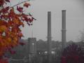
| 11/25/2002 11:10:00 PM |
Fading Factories in the Mountainsby nards656Comment: This picture gives me some mixed feelings. I like the subjects in distance. Greyscale is effective here. The angle makes the clock and the tower on the right the same distance to the center tower. This bit of colorful leaves, although adding a bit of color, not to mention probably a definite part of the composition is very distracting. NOTE: If this was not your intention for this photo disregard what is to follow. I'm seeing this as a little paradox - the beauty and color of nature vs. the greyscaled industrial factions. If this is the case, I would've found it much more effective to put the focus on the foreground leaves vs. the buildings in the background. Leave those out of focus to let your viewer know that your aim was to focus on the leaves. This is just my opinion. If the leaves have nothing to do with the shot in your initial intent, then leave them out as they are completely distracting. Good Luck - Inspzil |
| Photographer found comment helpful. |
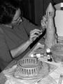
| 11/29/2002 04:44:00 AM |
Local Artist....by DigipixerComment: This is a photo I wouldn't be surprised to see in a newspaper. I don't think it's front page material, per se, but I could see it further back in the local or arts pages. I like the way there is some completed work and some work in progress. The only thing that would dramatically help this pic would be the woman's face shown a little better, where she would be a little more easy to recognize if you saw her in the grocery store. Good job - Inspzil |
| Photographer found comment helpful. |
| 11/19/2002 04:46:00 AM |
Memory Stickby jenaromComment: I like your idea. Colors, lighting and framing are all nice. Nice job - Inspzil |
| Photographer found comment helpful. |
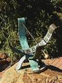
| 11/21/2002 05:11:00 AM |
Sun Timeby sulamkComment: I like the subject a lot. I don't know what happened to the background here though, it looks like the hedges or bushes are half gone. - inspzil |
| Photographer found comment helpful. |
Home -
Challenges -
Community -
League -
Photos -
Cameras -
Lenses -
Learn -
Help -
Terms of Use -
Privacy -
Top ^
DPChallenge, and website content and design, Copyright © 2001-2025 Challenging Technologies, LLC.
All digital photo copyrights belong to the photographers and may not be used without permission.
Current Server Time: 04/21/2025 10:52:24 PM EDT.