| Image |
Comment |
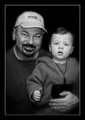
| 05/03/2007 07:15:11 AM |
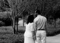
Day 3 - Weddingby bdennyComment: Great moment, nice conversion, good compositon.. I really like their hands.
Jack |
 Photographer found comment helpful. Photographer found comment helpful. |
| 05/03/2007 07:14:01 AM |
|
| Photographer found comment helpful. |
| 05/03/2007 06:34:04 AM |
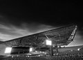
Day 3by TDCollinsComment: Overall I like the processing for this which seems appropriate for your subject and the effect you are going for. I like the grainyness too, but perhaps a bit too much in the sky. Finally if you're going to process this far I would try and get rid of the cars on the lower R of the picture. OVerall though it's an effective picture.
Jack |
| Photographer found comment helpful. |
| 05/03/2007 06:18:57 AM |
Day 2by edmengComment: Cool shot, good screen shot to show your PP. Very effective selective lighting with the curves and mask - nice job darkening the sky and the foreground area. Very sharp too. From a compostional standpoint I like the foreground leading into the building, I find the sky somewhat distracting (even though it is processed great) and I also find the tree on the L breaking up the nice diagonal line and repeating curves of the roofline.
Great job though, and thanks for the screen shot.
Jack |
| Photographer found comment helpful. |
| 05/03/2007 06:09:46 AM |
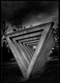
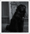
3 -Tagsby JutildaComment: Wow what a beautiful animal. I think I would have tried a bit of fill flash to fill in some shadows but you did a great job having him pose for you. I bit of a vignette may have helped also darken the corners, but the bright area on the gate really helps to pop him out. NIce job, Jack |
| Photographer found comment helpful. |
| 05/03/2007 06:05:52 AM |
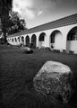
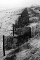
House of Sand and Fogby noranekoComment: Very nice, I think you're on the right track, but I agree with others that said to go for it - I think it could use more contrast, and a bit of diagonal to avoid the long vertical line of the fence. Great job, Jack |
| Photographer found comment helpful. |
| 05/03/2007 05:53:46 AM |
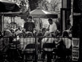
Day 2: Coffeehouseby RebeccaComment: I really like B&W for candid street shots, they are always interesting. Looks like pretty challenging lighting and you did a good job.
Jack |
| Photographer found comment helpful. |
| 05/02/2007 07:39:13 AM |
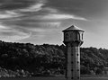
Birds of the Lakeby jdannelsComment: Originally posted by boysetsfire:
i kinda like the editing, the sky is damn cool.
i like "the lighthouse thing in the middle of the lake" would maybe pop out some more by making the tree's darker?
i wonder if i will suggest to anyone to make their image lighter during this month?
nick |
I agree with Nick... and interesting variation may be to layer over an "infra red" version wiht the blues much darker, the greens lighter, and then lower opacity to get the separation you want of the tower. Just a thought, very nice picture ... I really like the lighting here.
Jack |
| Photographer found comment helpful. |
| 05/02/2007 06:08:13 AM |
day 02by FirstyComment: Nice shot, I like the high contrast. I might have tried a variation that had a bigger dof since the bike seems to be the main subject rather than the ? cylinder head.
Jack |
| Photographer found comment helpful. |
| 05/02/2007 06:05:27 AM |
|
| Photographer found comment helpful. |
Home -
Challenges -
Community -
League -
Photos -
Cameras -
Lenses -
Learn -
Help -
Terms of Use -
Privacy -
Top ^
DPChallenge, and website content and design, Copyright © 2001-2025 Challenging Technologies, LLC.
All digital photo copyrights belong to the photographers and may not be used without permission.
Current Server Time: 04/22/2025 10:20:58 PM EDT.