| Image |
Comment |
| 07/16/2006 11:02:12 AM |
The Long Driveby ShaneBlakeComment: Funky colors,a bit dim, and blurred, but I like how you've interpreted "perspective." |
 Photographer found comment helpful. Photographer found comment helpful. |
| 07/16/2006 11:01:00 AM |
|
| Photographer found comment helpful. |
| 07/15/2006 03:35:35 PM |
Retired Colorsby amandaloreComment: Geez, send some of that "raw" talent this way!
Would you post some of your outtakes so other newbies like me can see how you did your backdrop? |
| Photographer found comment helpful. |
| 07/15/2006 01:23:01 AM |
|
| Photographer found comment helpful. |
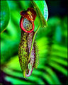
| 07/15/2006 12:50:29 AM |
Pitcher Plantby sherpetComment: I like the pitcher plant itself very much. Nice focus, amazing textures, and perfect DOF. I suspect the details on the "hairs" on the right are suffering from the small file and screen size.
Could you tone down the background a bit? It looks too saturated and competes with the subject. |
| Photographer found comment helpful. |
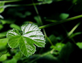
| 07/15/2006 12:21:09 AM |
Sharp Greenby amandaloreComment: I would have voted this a 5, so I think your score was pretty much on target.
The leaf's shape is interesting, its placement is good, and I think you did a nice job of focusing on it.
My two suggestions reflect what I'm trying to remember at the moment:
1) Watch out for the busy background. That stem going low left to upper right really takes my eye away from the focused leaf.
2) Low contrast between subject and background. Same leaf, but in red or yellow, would have really made it pop out. I'm not saying you could've found such a leaf, but I'd be curious how it'd look now if you tried it in post-processing. |
| Photographer found comment helpful. |
| 07/15/2006 12:12:52 AM |
|
| Photographer found comment helpful. |
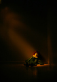
| 07/15/2006 12:11:00 AM |
The Resultsby amandaloreComment: This is a powerful shot. I actually prefer this one to the edited version. It's somehow more emotional - it says "raw response" to me more than the other one.
Okay, you could get rid of the spot on her right. But I prefer the angled tiles to be visible.
I really like how you left it open to interpretation! |
| Photographer found comment helpful. |
| 07/15/2006 12:06:54 AM |
too old to play with dollsby amandaloreComment: This shot and the title complement each other beautifully.
After thinking about it a bit, I decided I really like all the space at the top - it gives you the viewpoint of an adult looking down at the doll.
I'd love to see it lightened some, though, as others have suggested. It's just a little too hard to see the doll.
And congrats on your finish! |
| Photographer found comment helpful. |
| 07/14/2006 01:29:02 PM |
|
| Photographer found comment helpful. |
Home -
Challenges -
Community -
League -
Photos -
Cameras -
Lenses -
Learn -
Help -
Terms of Use -
Privacy -
Top ^
DPChallenge, and website content and design, Copyright © 2001-2025 Challenging Technologies, LLC.
All digital photo copyrights belong to the photographers and may not be used without permission.
Current Server Time: 04/16/2025 12:31:51 PM EDT.