| Image |
Comment |
| 03/25/2003 03:11:39 AM |
|
 Photographer found comment helpful. Photographer found comment helpful. |
| 03/25/2003 03:08:09 AM |
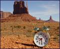
Timeless Beautyby ArtifactsComment: I see the timeless beauty of the background scenery (poorly focused as it is), but the clock in the foreground doesn't fit in very well. |
| Photographer found comment helpful. |
| 03/22/2003 02:36:57 AM |
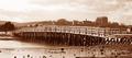
The old toll bridgeby marboComment: This is very nice work, I'm dissapointed at what it was given for a Final Score, I think you deserved higher. Nice job with the sepia, it is so appropriate in this shot. Even the background buildings fit well with your attempt to make this look old. I just have two suggestions that you can take or leave for what they are worth. 1.) Maybe a slightly different angle would have been better as the two houses on the ends of the bridge appear to be growing out of the bridge. 2.) Mabye placing the bridge higher in the photo (at 2/3 instead of 1/2)would have been more appropriate. The buildings in the background would have been still visible, but there would have been less sky and the bridge would have been more prominent. Keep up the good work! |
| Photographer found comment helpful. |
| 03/21/2003 02:43:31 AM |
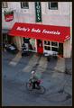
Simpler Timesby crabappl3Comment: Hey this is cool! Did you arrange that guy to be riding by on a bike with red on it, and he even has a red shirt tail hanging out? That's too freakey to be coincidence. Come on, tell the truth now! |
| Photographer found comment helpful. |
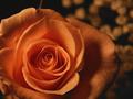
| 03/21/2003 02:38:57 AM |
A roseby BigSmilesComment: It's a very nice photo with nice colors. I am wondering how many comments you are getting on how it is not demonstrated by the photo that you have taken the shot "From Above"? |
| Photographer found comment helpful. |
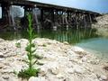
| 03/18/2003 01:37:10 AM |
Stream filterby xertionComment: Greetings from the C.C.!
First, I really like what you are trying with this photo, I like your willingness to try something different. I do have to agree with those that say the plant is distracting, but that is not necessarily a bad thing. The photo contains a bridge, but does not necessarily have to be only about a bridge. The plant does make the photo more colorfull and interesting.
Good color and lighting in the photo. I might have been better if the bridge were just a little lower in the shot. Some said the bridge was out of focus, I don't see that, the bridge is just farther away than the plant, so it seems out of focus. Overall, nice photo. You probably didn't have the nice bridges to work with like some do (The ones who medaled this competition.). So, you had to improvise with what you had. Keep up the good work! |
| Photographer found comment helpful. |
| 03/17/2003 02:41:02 AM |
|
| Photographer found comment helpful. |
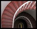
| 03/17/2003 02:26:49 AM |
Round and Roundby agwrightComment: I like this shot, and would have given a high mark, but for one thing. The stairs are well lit on the top, but there is insufficient lighting farther down. |
| Photographer found comment helpful. |
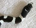
| 03/17/2003 02:25:03 AM |
baby snakeby LanSnakeComment: Very cute! A nice photo. Great focus, but it seems like the whole photo would have been improved by a different colored background, the background you employed is the same as one of the colors of the snake, which lessens the contrast. |
| Photographer found comment helpful. |
| 03/17/2003 02:23:13 AM |
Steps and Pillarby jjbeguinComment: Very nice concept here. I like the darkness, but it seems like you could have created better definition in the photo somehow, it just seems to all run together a little bit too much. |
| Photographer found comment helpful. |
Home -
Challenges -
Community -
League -
Photos -
Cameras -
Lenses -
Learn -
Help -
Terms of Use -
Privacy -
Top ^
DPChallenge, and website content and design, Copyright © 2001-2025 Challenging Technologies, LLC.
All digital photo copyrights belong to the photographers and may not be used without permission.
Current Server Time: 04/21/2025 06:23:54 AM EDT.