| Image |
Comment |
| 03/09/2003 03:55:00 AM |
|
 Photographer found comment helpful. Photographer found comment helpful. |
| 03/09/2003 03:46:21 AM |
|
| Photographer found comment helpful. |
| 03/09/2003 03:44:39 AM |
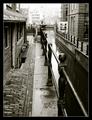
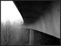
Into the Mistby karmatComment: The J curve is interesting but I think there's too much bridge! A vertical take might have been in the offering. |
| Photographer found comment helpful. |
| 03/09/2003 03:36:30 AM |
In Memory of Dreamsby CreativeFlyPhotoComment: I can't fault this photo too much but the hot spots just left of center and on the red ribbon to the right bottom are disturbing! I'm not out for blood, it's just my vision of this image! |
| Photographer found comment helpful. |
| 03/09/2003 03:25:31 AM |
"Taking Aim"by GolferDDSComment: The color of the table felt is not familiar! The cue ball doesn't seem to be in focus to me and it should be! The concept is good but the image lacks sharpness. IMHO |
| Photographer found comment helpful. |
| 03/09/2003 03:21:10 AM |
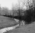
Reflections on a Canalby sherComment: Concentration on the center tree and it's reflection in the water might have been a better choice. The barren land in the foreground and on the left is just that, barren! I also think returning to the scene for a retake would be well worth the trouble! |
| Photographer found comment helpful. |
| 03/09/2003 03:13:41 AM |
Siloby BAMartinComment: This is a nice all around photo but I think the foreground is too heavy. There's a spot in the center foreground which I would cut and everything below it! Although this would be about 1/3 of your image lost, you would still maintain your lines. |
| Photographer found comment helpful. |
| 03/09/2003 03:04:46 AM |
say goodbyeby elgominComment: Making a decision on taking this photo must have been difficult. IMHO, there's too much lost detail on the left.The concept is good but I think I would have panned more to the right and focused on the passengers boarding! |
| Photographer found comment helpful. |
| 03/09/2003 02:55:10 AM |
Seagullby ChrisW123Comment: I've taken a lot of sea gull shots but nothing as nice as this one! The sea gull isn't the prettiest bird around but you wouldn't know it from this image! It's a nice pose and a great exposure! |
| Photographer found comment helpful. |
| 03/09/2003 02:44:32 AM |
Enduring Pillarsby GraciousComment: The extra effort in taking this photo is only too obvious! The results are marvelous! This image is well balanced and the exposure is excellent! Great job! IMHO |
| Photographer found comment helpful. |
Home -
Challenges -
Community -
League -
Photos -
Cameras -
Lenses -
Learn -
Help -
Terms of Use -
Privacy -
Top ^
DPChallenge, and website content and design, Copyright © 2001-2025 Challenging Technologies, LLC.
All digital photo copyrights belong to the photographers and may not be used without permission.
Current Server Time: 03/12/2025 02:39:50 PM EDT.