| Image |
Comment |
| 05/16/2004 02:41:33 AM |
A little wild violetby vtruanComment: Either the focus is a bit off or it's compression. Great colors and saturation and the composition is also very good. The background (brown branch) could have been blurred a bit more but it's not overly distracting in it's current state as the bright color of the flowers really grab one's attention. |
 Photographer found comment helpful. Photographer found comment helpful. |
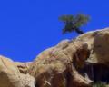
| 05/13/2004 02:18:40 PM |
Aloneby cimarron98Comment: Lots of compression artifacts distract me from fully enjoying this photo. It does look like you tried to do a soft focus and it would look very good without the excessive compression. The sky is a very deep blue and I like that. |
| Photographer found comment helpful. |
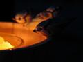
| 05/12/2004 06:56:04 PM |
Fire Waterby sevenine0Comment: Good application of negative space. The bird in the foreground is blurry. I assumed that was the main focus point and if so, it should be sharply focused. |
| Photographer found comment helpful. |
| 05/12/2004 06:53:49 PM |
Warming Upby cmberghoutComment: "What did you do this weekend, Bob?"
"Oh, not much. Just kicked back."
Sorry, just had to do that. :) Great action shot but it's too centered. If you left some negative space in front of the horse it would make a huge improvement. |
| Photographer found comment helpful. |
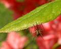
| 05/12/2004 06:51:27 PM |
Mosquito Heavenby ladpupmoeComment: Good application of DOF. Does the leaf really look like that? It looks like it's out of focus but the mosquito isn't. |
| Photographer found comment helpful. |
| 05/12/2004 06:48:29 PM |
My Life in Ruinsby TikicharmComment: I think you meant runes not ruins. Anywho, interesting subject but it has some issues with focus, noise and/or compression. |
| Photographer found comment helpful. |
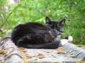
| 05/12/2004 06:46:48 PM |
My First Cat Photographby TallblokeComment: I would have rated this higher if the foreground was cropped a bit more enhancing the rule of thirds and focus point. Colors, saturation and focus are all excellent. I really like the look you captured of the cat. |
| Photographer found comment helpful. |
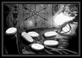
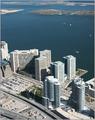
| 05/12/2004 06:44:15 PM |
Highest Pointby HRoxasComment: No kidding, this is WAY up. Nice vantage point and surprising details in the buildings. Contrast seems a bit bright but acceptable. I like how you included enough water to really enhance the feeling of distance. |
| Photographer found comment helpful. |
| 05/12/2004 06:42:02 PM |
Dangerfieldby banmornComment: Contrast looks a bit dark and color balance is a bit off as I can see a slight tint of red in the white areas on the Dalmation (not counting the area around the mouth). Subject is in nice focus. |
| Photographer found comment helpful. |
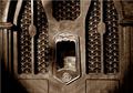
| 05/12/2004 06:34:35 PM |
Sounds From the Pastby ExoticChaosComment: Subject is blurry. Either lens has severe vignetting issues or just odd lighting. The duotone works well to depict age. |
| Photographer found comment helpful. |
Home -
Challenges -
Community -
League -
Photos -
Cameras -
Lenses -
Learn -
Help -
Terms of Use -
Privacy -
Top ^
DPChallenge, and website content and design, Copyright © 2001-2025 Challenging Technologies, LLC.
All digital photo copyrights belong to the photographers and may not be used without permission.
Current Server Time: 04/19/2025 01:57:50 AM EDT.