| Image |
Comment |
| 05/12/2006 01:09:07 PM |
Silk Flower Rhythmby chaliceComment by ericwoo: --Trading Post Comment--
Not a bad shot, just a little busy. I think this one would have scored much, much higher if the top of the frame had been cropped off. I am guessing that you left it so the viewer could understand what was in the frame. Quite honestly, I probably would have cropped it the same at first. I think that I would have tried to set up the shot so that none of the mirror frame or white wood were captured. I think that the sharpness and exposure are very nice. |
 Photographer found comment helpful. Photographer found comment helpful. |
| 05/12/2006 02:43:31 AM |
|
| Photographer found comment helpful. |
| 05/11/2006 09:14:52 PM |
|
| Photographer found comment helpful. |
| 05/11/2006 10:15:02 AM |
Night Light for the Wearyby chaliceComment by rennie: Nice panoramic effect. I like the fact that you didn't cropped the lower part. It adds depth to the picture. Great framing from up with the branches. Very interesting feeling. |
| Photographer found comment helpful. |
| 05/11/2006 08:45:41 AM |
Silk Flower Rhythmby chaliceComment by timfythetoo: Trading Post -
You have a good idea to start. This is the same idea as the slinky shot in this same challenge. I had a couple of issues withthis one. The colors were not as vibrant as they could have been. Same with the sharpness. I have never set up a shot like this, but more of a curve going into the mirrors would be nice. The slinky shot had a very nice curve going back. Also th eflowers just blend together toomuch as they go back and with such a vatiety o flines within the head of the flower the detail and separation just seem to get lost. I may hav ealso cropped the top off just above the second curve. The vertical lines above arent necessary and the blown out white doesnt seem to fit well IMO. |
| Photographer found comment helpful. |
| 05/10/2006 09:07:11 PM |
Silk Flower Rhythmby chaliceComment by Melethia: Trading Post comment
I gave this a 6 in voting. What made it work well for me is not just the rhythm/repetition of the flower, but the curve of the mirror and the lines/curves of whatever is behind it. Balance and composition of the picture are very good.
I'm a kind of monochromatic person so the blue/green in the reflection didn't suit me at first, but in looking at it again, it adds depth to the reflection. Should you want to remove it, you can by adjusting the color balance, increasing red, magenta and yellow (ie effectively decreasing blue, green, and cyan.) |
| Photographer found comment helpful. |
| 05/10/2006 12:48:33 PM |
Dad's Patricide Comedyby chaliceComment by posthumous: a black indie comedy about a Dad who thinks it's hilarious to act out his own son killing him. When he's found dead in the jacuzzi, is it suicide or patricide? Will that damn auteur director ever tell us? Okay, good poster. |
| Photographer found comment helpful. |
| 05/10/2006 09:15:08 AM |
Silk Flower Rhythmby chaliceComment by Kelli: Trading post...
Very cool shot! The colors are great as is the focus. The only fault I can find is the very bright white of the background with the blow out in the top left corner (my left when looking at it). I didn't vote this challenge but would have given it a 7. |
| Photographer found comment helpful. |
| 05/10/2006 08:33:41 AM |
Silk Flower Rhythmby chaliceComment by nards656: [[Trading Post]]
OOOHH! My first thought was "wicked cool", tempered by some of the flaws in the railings in the background. There's also a color shift to green as I see the flowers go from front to back, and it confuses me. This is a great composition. The background might be a bit too pure white for the rest of the photo. |
| Photographer found comment helpful. |
| 05/10/2006 08:30:53 AM |
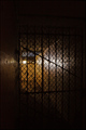
Secret WWII-Era Prison Discoveredby chaliceComment by nards656: [[Trading Post]]
Sorry I hadn't gotten around to commenting on this one yet! I really like the lighting. There may be other better ways to do it, but this screams "prison" to me. Some of the stuff in the background is a little confusing, though, and I spend too much time trying to decipher what it is. Probably would have given this a 5 or 6.
EDIT - for a PJ shot, this IS a bit too dark, IMHO. Message edited by author 2006-05-10 08:31:40. |
| Photographer found comment helpful. |
Home -
Challenges -
Community -
League -
Photos -
Cameras -
Lenses -
Learn -
Help -
Terms of Use -
Privacy -
Top ^
DPChallenge, and website content and design, Copyright © 2001-2025 Challenging Technologies, LLC.
All digital photo copyrights belong to the photographers and may not be used without permission.
Current Server Time: 04/22/2025 12:30:21 PM EDT.