| Image |
Comment |
| 11/11/2003 12:57:30 PM |
Beautiful sceneby lovelyshotComment: Alright, I guess I was tired last night and failed to see the power line across the top. You very well may have been going for some sort of ironic "nature obscured by technology" message, but in that case you should have shown more technology, like a telephone poll or a transformer box. Sorry, you go down. |
| 11/11/2003 12:56:02 PM |
brokenby JasperComment: A really cool concept. I think you might have wasted your excellent magnifying glass technique on too boring a subject. Use the magnifying glass to uncover a message, a meaning. Magnify a sweater to show that it's only made up of delicate threads. Magnify a silvery fish to illustrate that it's incandescence is a function of hundreds of shiny scales. This is just a distortion of an otherwise boring glass. |
 Photographer found comment helpful. Photographer found comment helpful. |
| 11/11/2003 12:52:58 PM |
A rose is a rose is a rose...by robert ellisonComment: Nice, but on second glance, you need to work on increasing you photo's resolution. And watch out for those shadows, too. They detract from your overall design immensely. |
| 11/11/2003 12:51:45 PM |
Intricacy of the Common Broomby alanfreedComment: Very cool, but I don't like the black space. You should have totally zoomed in on the broom, focused the viewer's attention fully on the textures and color. Maybe even get rid of the red clamp at the end and just have the bristles and red twine. |
| Photographer found comment helpful. |
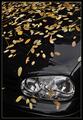
| 11/11/2003 12:48:18 PM |
Fall street stillby jjbeguinComment: A cool concept, a clean shot, but you need to recognize the perspective flaws that your photograph contains. This is a shot that is contingent upon clarity. The black car, the exquisite detail of the headlamps, the general opacity of the leaves...they add to the clarity. The reflections on the hood of the car, though, detract...majorly detract. I like how you were bold enough to zoom in, though...many people aren't confident that the viewer will be able to recognize their subjects if they were to zoom in. Keep trying. |
| Photographer found comment helpful. |
| 11/11/2003 12:45:07 PM |
Last Tune Before the Unknownby alexvoloComment: Looking back at this photo, I don't know why I didn't give you a 7 at first. This really took some skill on your party. I have a problem with it being in color, however. You've gone to great lengths to craft the shadows in this photograph, contrasting light and dark, black and white. The wood fretboard only serves to break up this otherwise picturesque example of juxtaposition. Your title is very wistful; b&w photography captures wistfullness best. |
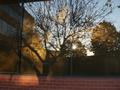
| 11/11/2003 12:39:27 PM |
shadows & reflectionsby johnny_justjohnnyComment: Keep trying, NYU boy. I think this photo would be better if you'd left out all the reflections except for the tree. Get rid of the brick on the bottom too, there's too much going on. Keep your photos true to their meaning. You want to show a reflection, so focus on the reflection. |
| Photographer found comment helpful. |
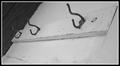
| 11/11/2003 10:42:31 AM |
Coat Hooksby MrsFuzzButtComment: There is one thing that you should change about this, and it's glaring. Get that regularly stained wood panel on the right side out. Get it out! Zoom in, work more closely with your subject. Don't be afraid to NOT show the whole scene; it illustrates that you are unafraid as a photographer and willing to take risks in the pursuit of a perfectly crafted composition. You need to exploit the texture, the feeling of the wood grasping these hooks. |
| 11/11/2003 10:40:29 AM |
half tangerine with grapesby darcyComment: This picture needs a lot. First, there's a clash between unpeeled fruit and untouched fruit. You bring this conflict to light because you failed to focus on just one subject. All the fruit tends to have the same focus. The orange and it's rind have such potential for texture exploration, but you haven't exploited it. |
| Photographer found comment helpful. |
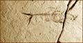
| 11/11/2003 10:38:35 AM |
Still for Milleniaby sagestudioComment: Very cool concept (yes, it's still life alright). You filmed the textures very well. You could have used this lighting to your advantage, however. A little patience on your part might have revealed some really complex shadows, with all the ridges of the fossilized skeleton. Good spacing--way to make your subject off-center, it shows you have a good idea of spatial design. |
| Photographer found comment helpful. |
Home -
Challenges -
Community -
League -
Photos -
Cameras -
Lenses -
Learn -
Help -
Terms of Use -
Privacy -
Top ^
DPChallenge, and website content and design, Copyright © 2001-2025 Challenging Technologies, LLC.
All digital photo copyrights belong to the photographers and may not be used without permission.
Current Server Time: 03/13/2025 07:41:34 AM EDT.