| Image |
Comment |
| 06/30/2004 02:23:16 AM |
|
| 06/30/2004 02:22:14 AM |
|
| 11/11/2003 10:36:15 PM |
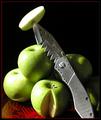
Sink Your Teeth Inby vonautschComment: Great pic. I'll elaborate about what I like and don't like. This is a very intersting concept and very well executed except for the shadows. In my opinion, they crowd the shot too much, and they definitely make weird designs that detract the viewer's attention from the knife. Also, this photo doesn't need that red dish (? i think it's a dish) at all. Zoom in, crop things out, and be bold with your statement of green, silver, and black. |
 Photographer found comment helpful. Photographer found comment helpful. |
| 11/11/2003 10:31:37 PM |
Narcissistic Potato Masherby QuadrajetComment: Excellent example of still life, but it's just nowhere as good as some of the others. I would try to think more about what the challenge will mean to different people, and then think about what it will mean to you. This would probably be excellent for another challenge, just not this one. |
| Photographer found comment helpful. |
| 11/11/2003 10:27:44 PM |
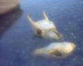
Predator and prey (deer and coyote) skulls in waterby WhidbeyPixComment: Way too blurry for it's own good. The thing about bone and skulls is that they have a texture all their own. I usually like seeing skulls photographed in black and white because it gives them this bleached, dry personality. But yours are wet. Fine. I just don't get what you were trying to accomplish with the blur...as a viewer, I'm confused. That shouldn't happen. |
| Photographer found comment helpful. |
| 11/11/2003 10:26:09 PM |
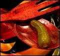
Still Life with Pickleby fleenkComment: Get rid of the pickle...substitute a red chili pepper and this could've been greatness. Your sense of color and mood is incredible...except for that damn pickle! Really this is great. Excellent job. |
| 11/11/2003 10:24:49 PM |
Just Add Breathby KoriyamaComment: I'm not sure why I gave this a four. I think I didn't like the black background at first. I look at it now and see that it's full of detail. It would have been better had you zoomed in more, and possibly projected the notes onto the flute. I don't know, maybe you did that, but it's not apparent. You get a 6. |
| Photographer found comment helpful. |
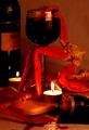
| 11/11/2003 10:22:04 PM |
ENOUGH IS ENOUGH ...by altamaxComment: What an eerie photo. Very poetic, somehow. I'll elaborate. The lighting is incredible, almost totally self-sufficient, actually. The color extablishes a warm mood, and the crableg makes it eerie. That's not a bad thing. You've got a keen sense of warmth and color. I just don't like the spilled wine, I don't know what it means. In this type of photo where you set the mood so perfectly and in such a unique way, you need to show you're totally in control and not accidentally putting together a bunch of 'things'. Make the viewer think you're in control! |
| 11/11/2003 10:13:50 PM |
|
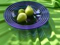
| 11/11/2003 10:13:19 PM |
Green on Blue on Greenby sonasandComment: Good concept. Patchy execution. I'll elaborate. It's not very clear in terms of resolution, and I don't think that's what you were going for. The textures that mix together in this photo could very well spell the difference between your 6 and, say, an 8. Not a huge fan of the dish, although I like the transposition of wrinkled blue on wrinkled green. You should be commended for making green and blue look good together as well; not many people do that correctly. |
Home -
Challenges -
Community -
League -
Photos -
Cameras -
Lenses -
Learn -
Help -
Terms of Use -
Privacy -
Top ^
DPChallenge, and website content and design, Copyright © 2001-2025 Challenging Technologies, LLC.
All digital photo copyrights belong to the photographers and may not be used without permission.
Current Server Time: 03/13/2025 02:31:30 AM EDT.