| Image |
Comment |
| 06/30/2004 03:00:22 PM |
Save a Horse, Ride a Cowboyby L1Comment: this has the appearance of being let down slightly be the over-use of neat-image or some such. a grainy shot is probably preferable, to be honest... i'm only guessing, but it would be that you also blurred the background - this is seemingly apparent from whats left around the ears and side of face. third and final point is that the lighting seems harsh - i'm completely no expert, but it might help if your model didn't look into the light source, becuase it makes the eyes contract and appear not quite natural. the pose and ocmposition is very good though, and cropping out half the hat is a good move (it's weird how many would want all the hat in the shot). |
 Photographer found comment helpful. Photographer found comment helpful. |
| 06/29/2004 05:54:20 PM |
Reachingby C-town driverComment: i will be adding this to my favourites, because there is a lot i love about the shot. have you, however, considered possibly cloning out the tree if it were at all possible; it's just that i think it slightly unbalances an otherwise spuerbly excellent image... |
| Photographer found comment helpful. |
| 06/29/2004 02:33:31 PM |
Aliciaby jodiecostonComment: this is a nice picture, but the angle is a bit too interesting to fully appreciate, in that it hurts my neck to see the girls face. the eyes have reflected the light in a bit of disconcerting and strange way so that very little of the pupils and irisi are actually visible - this is something that might have been reduced with a bit of cloning in PS or similar. on the whle, i like it, the girls face is visually appealling and the technicial skill taking the shot is obviously very high. perhaps it would be easier to view if reflected along one axis or rotated 180°, so the top of her head is closer to one of the top corners... 7. |
| Photographer found comment helpful. |
| 06/29/2004 02:27:49 PM |
flirtaceous. by theodor38Comment: This is a very charismatic shot that deserves to do bloody well. your bloke is well posed / composed, and all the whites and creams in the picture compliement as a whole. very nice - 9. |
| Photographer found comment helpful. |
| 06/29/2004 02:59:49 AM |
Blond light by LouisonComment: a lovely looking face - her hair is really complimented by the yellow background, so good choice there. and the pose is different enough to be interesting for that alone. eyes are nicely in focus (were they whitened up a bit?), though i would add that i think the soft focus is just marginally over done. but overall, well, a definite ribbon contender. 10. |
| Photographer found comment helpful. |
| 06/29/2004 02:59:13 AM |
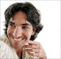
Low-Key Rembrant Lightby JoelHSmithComment: a nice, old fashioned, traditionally taken, high quality portrait shot. techinically i would say this is without flaw, though i would add that the guys eyes seem a bit tense (guy needs to relax a bit) and also, does he know he looks like Shaggy from Scooby Doo? 10 |
| Photographer found comment helpful. |
| 06/29/2004 02:54:11 AM |
The Journalistby ImagineerComment: i like this a lot. i don't know if it IS a good portrait though - it seems too not posed really, but then this could be testimony to your models fine acting skills, and he is posing a non-posing pose. i adore the colours and greeny-whites; did it come out of the camera that way? all the colours have the same tone to them, like the suit jacket and the background. i think this is great - 9 |
| Photographer found comment helpful. |
| 06/29/2004 02:51:18 AM |
Going to the Chapelby crabappl3Comment: this is a nice wedding-type shot. the softening of the focus is a little more than subtle, but hasn't been overly done (read: just right). her face might benefit from a little more light / post editting brightening up, but that aside i think it's a bloody good job. especially like the soft glow from the viel... and her smile seems genuine too, which means it doesn't feel as staged... 9. |
| Photographer found comment helpful. |
| 06/28/2004 04:36:26 PM |
Someday.....by geewhyComment: good picture! lighting is superb, the pose / posture is very nice. her hair is very neat, gives the impression it has been touched up a little bit (and left a slight halo whiteness effect). but that said, still worthy of a ten in my book (one of three in this challenge). i like especially the mix of greys and blacks of her hair, t-shirt and the background. tastefully done.
|
| Photographer found comment helpful. |
| 06/28/2004 04:33:00 PM |
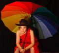
Lady in redby asijComment: this displays a brilliant use of colour for the challenge. most amazingly about this shot is that your model remains incredibly attractive even with THAT hat. and isn't it unlucky to where a hat with a brolly? i think it's one accessory too many. but this is a great shot, nice and bright, possibly slightly too neatimaged? also, i might have considered cropping the top off the brolly, so the girl filled more of the shot. still, as i said, great shot. 8. |
| Photographer found comment helpful. |
Home -
Challenges -
Community -
League -
Photos -
Cameras -
Lenses -
Learn -
Help -
Terms of Use -
Privacy -
Top ^
DPChallenge, and website content and design, Copyright © 2001-2025 Challenging Technologies, LLC.
All digital photo copyrights belong to the photographers and may not be used without permission.
Current Server Time: 04/21/2025 06:29:15 AM EDT.