|
|
| Image |
Comment |
| 06/19/2006 04:32:54 AM | Enlighteningby DigiFotoBuddyComment: CPTII
Actually, the shot looks better the longer you stare at it.
It was a great idea, albeit not very obvious e.g. the low DNMC scores.
The subject was, honestly, still a bit too dark. A 30-second expsure with a 1-second exposure for the light would've looked better, I think.
Just a suggestion, though. |  Photographer found comment helpful. Photographer found comment helpful. |
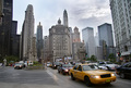
| 06/19/2006 04:22:10 AM | City Architectureby DigiFotoBuddyComment: CPTII, oi!
Dude, this one's more of a cityscape than an architecture entry.
That isn't to say that it doesn't meet the challenge, though. Actually, it does. Quite deviated from the norm, however.
I quite like the buildings in the BG (OMG the subjects's the BG hehe) and the general feel of the whole thing borders on melancholia.
Nice work, Shailesh. | | Photographer found comment helpful. |
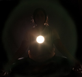
| 06/19/2006 04:12:13 AM | Selfby DigiFotoBuddyComment: CPTdos, ayos!
Not very creative or gimmicky, but still a well-done SP. The red background hurts my eyes and you would've been more guapo without it.
Flash-lit? A diffuser in front of that white light source would help, IMO. | | Photographer found comment helpful. |
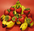
| 06/19/2006 04:08:08 AM | Strawberry Bananaby DigiFotoBuddyComment: CPTtoo, only later!
OKay, I'll keep it short:
(+)
Nice subject -- or subjects, rather. The subtle vibrancy of the colours do take the cake for this particular shot. The choice of BG's not really that great, but works nonetheless,
(-)
The shallow DOF was very detrimental as I bet a lot of people took of points for it. It was very distracting and compositionally unhelpful. A deeper DOF would've worked better.
The shadows under the banana don't help as well. A diffuser in front of the light, or maybe a repositioning, would've lessened (or eliminated) said shadows.
Good luck on next challenges! | | Photographer found comment helpful. |
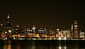
| 06/19/2006 03:59:27 AM | C.H.I.C.A.G.O.by DigiFotoBuddyComment: CPTII, oi!
Wow, nice cityscape. Flip it horizontally and you'd've got "DPC" on them lights.;p
The colours are amazing, the exposure dead on, but it's the sharpness (or un-sharpness, rather) that hurt your shot, placing it where it is now. So mebbe a little more sharpening next time. | | Photographer found comment helpful. |
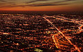
| 06/19/2006 03:54:06 AM | Dusky Pulsating Cityby DigiFotoBuddyComment: CPTII, oi!
This shot burns the eyes, yeah?;p
It doesn't really fit that well in this particular challenge but still, it's a nice cityscape.
Wouldn't have the composition any other way, ang I guess a little sharpening wouldn't've hurt. Nice sky as well. | | Photographer found comment helpful. |
| 06/19/2006 03:39:22 AM | "Sitting in his nowhere land"by yankoComment: CPTdos, ayos!
Very funky PP, Richard! Yeah, I like the darkness of this.
Also, great take for the challenge. I'd un-crop a bit from the right side, but all in all, it's a great photo.
I'd've woken up the guy, were I you, and ask if he's sleepy. Hehe. | | Photographer found comment helpful. |
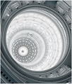
| 06/19/2006 03:33:40 AM | Texas State Capitol Buildingby yankoComment: CPTDos, ayos!
Quite a different rendering from other shots of th same subject. Very good, sir.
The duotone and angle WORKS, as far as I'm concerned.
Like your still life entry, this one looks very clean, and crisp. As usual, great clarity and tonality.
It's amazing to watch you progress and steadily improve in this. It's pretty inspiring, actually.
Rock, sir. | | Photographer found comment helpful. |
| 06/19/2006 03:18:06 AM | Virtudes Angelicalesby yankoComment: CPTII, oi!
Very cool shot, sir. It looks very much like a digital painting -- which is a compliment, by the way.
The great colour duality and the dramatic lighting make this a winner in my book. My favourite for the challenge. | | Photographer found comment helpful. |
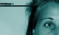
| 06/09/2006 05:26:05 AM | Driving People Crazyby GunnsiComment: CTPII
Not a bad photo, sir. It's just that your concept seemed not too well thought of -- as the DRIVING PEOPLE CRAZY tag wasn't particularly evident in your shot. Also, the blue duotone seemed a random choice for PP. Sorry if I'm making assumptions here, but that's what I see.
Point of improvement: a different facial expression on the face, and a huge bump up in the contrast department. With that, i guess you could keep the blue duotone.
Good luck on the next challenges! | | Photographer found comment helpful. |
Home -
Challenges -
Community -
League -
Photos -
Cameras -
Lenses -
Learn -
Help -
Terms of Use -
Privacy -
Top ^
DPChallenge, and website content and design, Copyright © 2001-2025 Challenging Technologies, LLC.
All digital photo copyrights belong to the photographers and may not be used without permission.
Current Server Time: 03/12/2025 03:19:02 AM EDT.
|