| Image |
Comment |
| 06/14/2003 04:30:13 PM |
ELLEby jenaromComment: This woman is beautiful; the shot is pretty good. The lighting seems kinda harsh/bright for an Elle-style cover, the bright spot on the right side of her face is distracting. The hair should have been a little more in place too. I dont know about the choice of background.... |
 Photographer found comment helpful. Photographer found comment helpful. |
| 06/14/2003 04:24:02 PM |
Firehouse Magazineby DiversqComment: Hmmmm, interesting. I liike any photograph that incorporates fire. I think you should have tried to get some light on the front of the helmet/flag... too dark. |
| Photographer found comment helpful. |
| 06/14/2003 04:07:23 PM |
American Entomologist by connieComment: Ahhhhh this is a beautiful shot. My only real complaint is that the photo feels kinda out of place with the studio setup (i.e. white background). The butterfly alone, or the flower alone on the stark white is fine, but with both together my mind wants to know "where's all the grass, trees, and other greenage in the background?" |
| Photographer found comment helpful. |
| 06/14/2003 04:05:10 PM |
"DOG WORLD"by melissartsComment: This shot loses points for looking like it was taken in 2 seconds. I dont think it gives off a professional feel worthy of a mag cover. Colors in the sky are a bit oversatureated... |
| Photographer found comment helpful. |
| 06/14/2003 04:04:01 PM |
New Scientistby PaulkComment: Hmmmm... I like the concept, how the bottom of the jar fades into a perfect brightness. However I dont like how the printing is backwards, instinctually I need those numbers and words to be on the frontside so it doesnt 'bother' me. |
| Photographer found comment helpful. |
| 06/14/2003 04:02:05 PM |
Backpackerby kellymcgComment: Beautiful colors for this sillouhete. Would like to see more separation of the bottom of ther person from the rock. She melds into it too much to distinguish. Same thing with the head, maybe have her turn to a side so we can get a better, more human-looking profile to the face. |
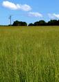
| 06/14/2003 04:00:03 PM |
The Ecologistby UberFishComment: I like the radiant colors. Like the grass as dominant subject. Dont like The telephone poles/wires, especially for the chosen magazine. |
| Photographer found comment helpful. |
| 06/14/2003 03:59:03 PM |
Kids Worldby xertionComment: Nice tonal range. Face might be a liiiiiitle too dark in that shadow, but otherwise great. |
| Photographer found comment helpful. |
| 06/14/2003 12:59:08 PM |
Bloop!by hockeyfanComment: GREETINGS FROM THE CRITIQUE CLUB!
Congrats on your first submission!
Well, I agree with others that the lighting is a bit too 'depressing' in this photo. In these kind of stop action shots very bright lighting works best. You want that background typically to appear completely white. Also, we need to see a lot more splash or droplets. The few 'baby' ones tht you have captured arent enough to convey movement really. I dont mind the negative space at the top so much, although I think it'd be better filled with some more droplets. Although this genre of shot has been overdone as another commenter mentioned, its a good shot to practice. Next time pump up the lights and get more water involved.
 Buck Gilchrist |
| 06/14/2003 12:42:12 PM |
Sound of Freedomby marinajoeComment: GREETINGS FROM THE CRITIQUE CLUB!
Ok, you're taking a picture of Miss Liberty which is a stature thats been photographed at least a billion times. With this sort of competition, you can be sure your score is going to suffer for every minor detail. We've seen too many perfect shots before....
The shot looks to be in good focus, but the cropping at the knees wasn't the best move. The shooting angle is too average. This angle can work if you have 'something additional' to make the photo original. Like if we had some early morn or late evening light bathing the stature in a nice glow, the angle wouldnt make a difference. But with the current light setup this angle is a bit boring. The cloud formation to the left of the statue detracts attention away from the main subject also...
In short, I'd say its a decent photo, just needs 'something special' to make it different from every other Liberty photo I've seen. If you live close enough to the harbor, I'd say venture out again when the weather/light is more favorable, and get her feet in the shot next time!
Buck Gilchrist |
Home -
Challenges -
Community -
League -
Photos -
Cameras -
Lenses -
Learn -
Help -
Terms of Use -
Privacy -
Top ^
DPChallenge, and website content and design, Copyright © 2001-2025 Challenging Technologies, LLC.
All digital photo copyrights belong to the photographers and may not be used without permission.
Current Server Time: 04/11/2025 05:46:54 PM EDT.