| Image |
Comment |
| 05/05/2007 03:15:01 AM |
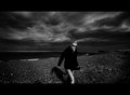
Day 3 - Gazing Skywardby ArtysteComment: Originally posted by Art Roflmao:
Not a comfortable crop or angle for me. Even though the lens was not well suited, I think it came out with an interesting, old-style photo effect with the DoF. |
Yah.. I know. The crop was necessary due to foreground elements.. and like I stated, it was going to be a throw-away.. but I had to convert *something*. heh. |
| 05/05/2007 03:11:22 AM |
by boysetsfireComment: Now here's someone that put a little work into things :)
Wonderful dark and stormy mood, and the "widescreen" aspect (which  bucket bucket also uses a to great effect), is a fabulous choice.
I need to get myself a good wide-angle lens for shots like this. Although I'd also need to move somewhere that had landscape like this. lol.
Probably my favorite of this project so far. Message edited by author 2007-05-05 03:11:56. |
 Photographer found comment helpful. Photographer found comment helpful. |
| 05/05/2007 03:07:53 AM |
Day 4: Oh Snap!by RebeccaComment: Quite beautiful in its starkness.
I love the conversion as well... you've captured some fine tones, and given the shot an almost "infrared" look. Textures are very lifelike.
I might have pulled back the sharpening a *touch*, myself.. but that's my only piddly complaint. |
| Photographer found comment helpful. |
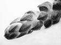
| 05/05/2007 03:05:50 AM |
stella.jpgby electrolostComment: A fun action shot.
I could go on all day about the dangers of shooting off-white animals in direct sunlight, but eh.. :) |
| Photographer found comment helpful. |
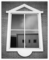
| 05/05/2007 03:01:44 AM |
Day 5by edmengComment: I really like this shot. The over-sharpness really works for this particular shot, and reminds me a lot of some work I used to see in B&W magazine before they became 90% ads. The grain adds an old-time element, and the perspective even works for me, although I imagine you'll get comments to the effect that you could try and fix it.
One of the better subjects and compositions in this project I have seen yet. A good eye and a good instinct for choosing to go the way you did with this one. |
| Photographer found comment helpful. |
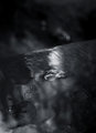
| 05/05/2007 02:59:02 AM |
Day Five: Catching Fliesby Art RoflmaoComment: Always a source of inspiration :)
The use of the cool tone here makes me think he's trying to catch rain-drops instead of flies ;) |
| Photographer found comment helpful. |
| 05/02/2007 11:51:13 PM |
Day 2 - Raindropsby ArtysteComment: Originally posted by mystopia:
I love the smoothness of the water and the drops suspended, quite a contrast. The tones are very nice. Is this the deck rail? |
Indeed it is, nice deduction. |
| 05/02/2007 08:03:28 PM |
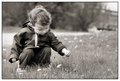
2by mia67Comment: No fair using a cute kid :)
I think a little more work on some selective sharpening could really work wonders on this shot (as well as increasing the contrast in the grasses).
Other than that, you've got a very playful image with a pretty strong composition. You've captured a great moment. |
| Photographer found comment helpful. |
| 05/02/2007 05:48:02 PM |
Day 3by daboardergirlComment: A fun triptych indeed. Your conversion is lovely, great tonal ranges. The border here, while I think great for a large-sized print in a frame, isn't helping you much for a DPC sized upload. I think if you knocked a good 25 pixels off the edges, or increased your photo sizes a little, it'd have more impact as a web-view.
On a further note.. have you tried putting the far right image in as the middle? I think this would provide a fascinating "expression" anchor. With the amusing "funny-face" on the left, the soft, neutral pose in the middle, and then bookended with the final, "I'm too happy to be alive" look :) Message edited by author 2007-05-02 17:49:57. |
| Photographer found comment helpful. |
| 05/02/2007 05:42:39 PM |
PAD B&W Day 2 Untitledby noranekoComment: I don't think the grain really works to effect here. What it does for me is makes it seem like some over-compensation has been done for a lack of inherent sharpness. If you note the eyes, they look "scrambled" almost, lack detail, and the grain makes them look artificially over-sharpened.
One thing that I've noticed over the last little while is the 'tone-map' effect in B&W images. I don't feel that it works very well, as the conversions tend to *really* highlight halos in greyscale, and help to increase the overall feel of non-reality, or hyper-reality. While this can work in an artistic way, and is more a matter of personal taste, I think when it's applied to a piece that begs for a more traditional application, such as this portrait, it's the wrong way to go. (I'm not saying tone-mapping *was* used, but this definitely has the look and feel of some kind of tone-mapped/shadows-highlights work). Just something to look for. The haloing around the hair especially shows this.
I think this also begs more for a rectangular crop, but that's *definitely* a matter of personal preference.
Having said all of the above.. what I do really like about this is the pose and expression. A candid moment, an almost angry, wistful look on the face. We're left wondering what this child is thinking and feeling, and why they are looking off where they are. What is over there..
A good step. |
| Photographer found comment helpful. |
Home -
Challenges -
Community -
League -
Photos -
Cameras -
Lenses -
Learn -
Help -
Terms of Use -
Privacy -
Top ^
DPChallenge, and website content and design, Copyright © 2001-2025 Challenging Technologies, LLC.
All digital photo copyrights belong to the photographers and may not be used without permission.
Current Server Time: 04/16/2025 01:08:41 AM EDT.