| Author | Thread |
Comments Made During the Challenge  |
|
|
05/12/2002 07:55:00 PM |
| Scary that atleast 2 minds think that alike. Great clarity and color. grat photo!! |
|
|
|
05/12/2002 05:17:00 PM |
|
|
|
05/12/2002 05:51:00 AM |
|
|
|
05/11/2002 09:02:00 PM |
| You didn't even use my picture! ;o) Great idea and implementation. One of my top 10 this week! |
|
|
|
05/11/2002 06:54:00 PM |
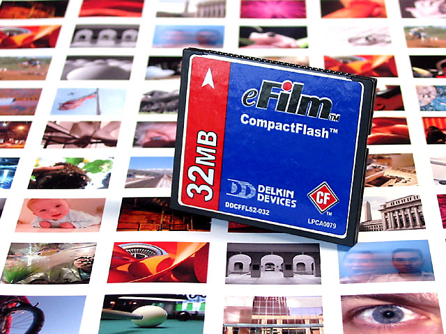
My camera uses the other kind...
Are those your photos or a stock sheet/book? |
|
|
|
05/11/2002 05:18:00 PM |
| I love it's simplicity. Very well done. |
|
|
|
05/11/2002 10:18:00 AM |
|
|
|
05/10/2002 03:06:00 PM |
|
|
|
05/09/2002 09:25:00 PM |
| very nice....good ad, I like the lines that sort of draw your eye upward to view the whole photo and the statement this makes. Nice job! |
|
|
|
05/09/2002 09:01:00 PM |
| Interesting concept. Controversial, too, I see! But, you have my daughter's flag picture, so it's a hit with me! |
|
|
|
05/09/2002 03:27:00 PM |
| so its paper film now. idea lacks excitement. the position of the card is annoying. |
|
|
|
05/09/2002 01:32:00 PM |
| Good pic. you chose some nice ones for the background. the blurring at the top is a little frustrating, though I guess it make the main object more clear. |
|
|
|
05/09/2002 04:56:00 AM |
| I like this. I would have preferred to see all the photos on the contact sheet different, but the effect works anyway |
|
|
|
05/08/2002 09:24:00 PM |
|
|
|
05/08/2002 05:21:00 PM |
| Not enough good photos to not duplicate. Interesting selection. |
|
|
|
05/08/2002 03:55:00 PM |
| Cool, I see my picture! Nice job. Clean and simple. Very effective. I would want at least a 128 mb card though : ) |
|
|
|
05/08/2002 07:58:00 AM |
| love it. except i dont see any of my pics on your print out. harumph! |
|
|
|
05/07/2002 11:38:00 PM |
| so do you have copyright from all the reused pictures ?:) Good shot - reflections on the memory card spoil it, needs a more defuse light source I guess, but it is hard to do much better without 'pro' equipment |
|
|
|
05/07/2002 11:30:00 PM |
| Great use of color and sharp foucus. |
|
|
|
05/07/2002 10:50:00 PM |
| Cool, how did you get everyones photo on the paper? |
|
|
|
05/07/2002 10:16:00 PM |
| Great concept going here. For some reason the lighting on the memory card causes the logo to look wrinkled. That's the only possible drawback....excellent photo. |
|
|
|
05/07/2002 05:36:00 PM |
| I recognize these thumbnail shots, but I use a SmartMedia card! Sorry! Good composition. |
|
|
|
05/07/2002 12:19:00 PM |
| You definitely know the audience - great colors, too! |
|
|
|
05/07/2002 04:40:00 AM |
Most of the photos shown here are a lot more interesting than this one :/
|
|
|
|
05/07/2002 01:54:00 AM |
|
|
|
05/06/2002 10:47:00 PM |
| hey - i didnt give consent for my photo to be in this! actually, mine isnt in here, but i like this idea. |
|
|
|
05/06/2002 10:45:00 PM |
| I don't see any of mine there = ( lol, j/k Very good advertisement shot. I'd be tempted to buy the product, but 32 megs isn't enough ; ) Nice sharp focus and color. |
|
|
|
05/06/2002 10:43:00 PM |
| Very Clever... I like the contest pics in the background |
|
|
|
05/06/2002 06:18:00 PM |
| Great shot, and really great idea! I would have avoided repeating photos, but that's really minor. |
|
|
|
05/06/2002 05:14:00 PM |
| I like how you incorporated the dpchalleng pictures in there |
|
|
|
05/06/2002 03:00:00 PM |
| Nice shot! Excellent concept and i think it would sell this product. |
|
|
|
05/06/2002 02:48:00 PM |
| A little too much glare at the top of the pic. But a very interesting shot. |
|
|
|
05/06/2002 02:29:00 PM |
Fantastic ad shot, there is some slight reflection on the label of the CF card but I can let it slide with the rest of the shot being so vivid and smart.
|
|
|
|
05/06/2002 12:46:00 PM |
| Very cool idea, nice and sharp focus...i see my pic |
|
|
|
05/06/2002 12:43:00 PM |
| This works in soooo many ways! I really like this one. Photo 10 Advert 10 Creativity 10 total score 10 (I don't give out 10 total easily) |
|
|
|
05/06/2002 10:14:00 AM |
| Clever idea and nice set up, clear, sharpe and lots of colors. More gaussian blur or higher aperture to make the CF stand out. I find myself looking at the thumbnails. |
|
|
|
05/06/2002 08:04:00 AM |
| Excellent idea! I especially like the selection of photos. The eye, portrait and arches in the lower right corner are especially good choices for foreground. The only thing that I would change would be to move the baby pic down next to the eye (Babies sell). |
|
|
|
05/06/2002 07:43:00 AM |
| Only 32mb? :) Nicely framed, and focused. |
|
|
|
05/06/2002 04:41:00 PM |
| nice idea to combie the card with DP Challenge pics. |
|
|
|
05/06/2002 03:36:00 PM |
| Great colours, good submission but can't see any of my shots here! - Drew or Langton? |
|
Home -
Challenges -
Community -
League -
Photos -
Cameras -
Lenses -
Learn -
Help -
Terms of Use -
Privacy -
Top ^
DPChallenge, and website content and design, Copyright © 2001-2025 Challenging Technologies, LLC.
All digital photo copyrights belong to the photographers and may not be used without permission.
Current Server Time: 03/10/2025 09:57:44 PM EDT.