| Author | Thread |
|
|
08/19/2002 03:25:00 AM |
| Way to go Frank, you really captured the sky perfectly... |
|
Comments Made During the Challenge  |
|
|
08/16/2002 11:10:00 PM |
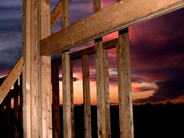
Well......You are the proud owner of the only "10" I see this week. Sad to say but that inclueds my entry also. I love the warm rich colors and the clarity and grain of the wood. =10 syamjonimi
08-18-2002
I find I have to edit this comment....This photo is the first 10 for the week. I just voted one other picture into the 10 category. |
|
 Photographer found comment helpful. Photographer found comment helpful. |
|
|
08/16/2002 07:48:00 PM |
| Beautiful sunset, too bad the challenge made you put a house under construction in front of it. (I hope you took a spare w/o the house!) The wood is very well photographed, but I honestly don't like it covering the sunset. Still 9... Swash |
|
| Photographer found comment helpful. |
|
|
08/16/2002 06:58:00 PM |
|
| Photographer found comment helpful. |
|
|
08/16/2002 03:59:00 PM |
| I like this photo, although I really don't like to see the challenge name (new) used in the title... too cliche. Get out your thesaurus and crank up your imagination. Photo is really great. |
|
| Photographer found comment helpful. |
|
|
08/16/2002 03:03:00 PM |
| great lighting... i like the sunlight but perhaps you shouldn't use the flash (make the house looks darker and i'd move the camera back a bit to capture the new house in the foreground and absorb that light, with a tripod! 7 |
|
| Photographer found comment helpful. |
|
|
08/16/2002 12:28:00 PM |
| This is beautiful. The owner of this new house is very lucky to be able to view that sunset every night. At first, I thought that the virtical post to the left was not even with the edge of the photo. As I kept looking at it, I wasn't sure, so I measured it and it is almost as perfect as perfect gets. However, I was trying to figure out why it originally looked tilted a bit, and I realized that it is because the horizon is not straight, and being a lighter color at the top, and a darker color at the bottom, it makes that particular post only appear to be crooked. This isn't a photographer error, or camera error, or any error for that matter. Just a trick on the eyes, more like an optical allusion. So I chose to ignore it. lol. This depicts new, it is visually appealing, and I think it even goes by that "rule of thirds" that is currently being discussed in the forums. Great shot! Good luck in the challenge. |
|
| Photographer found comment helpful. |
|
|
08/16/2002 04:54:00 AM |
| beatiful light, composition is so-so. |
|
| Photographer found comment helpful. |
|
|
08/15/2002 11:19:00 PM |
| perhaps the natural silhouette of the frame would have been more apealing |
|
|
|
08/15/2002 10:46:00 PM |
| There were a multitude of new building photos this week, but I really liked the background on this one. |
|
|
|
08/15/2002 04:51:00 PM |
| Excellent take on this subject, and great execution with the sunset behind. Nice work! |
|
| Photographer found comment helpful. |
|
|
08/15/2002 04:22:00 PM |
| Fantastic colors and good composition. Nice job. Score-7 Kee |
|
| Photographer found comment helpful. |
|
|
08/15/2002 08:33:00 AM |
| This is a beautiful shot. It captures the sky and the foreground with great aplomb. DOF is absolutely top notch, it has great drama and wonderful atmosphere� (10) |
|
| Photographer found comment helpful. |
|
|
08/15/2002 06:20:00 AM |
| can;t really see if it's a new house or not, but the sunset looks very nice though... |
|
| Photographer found comment helpful. |
|
|
08/14/2002 04:42:00 PM |
| just beautiful I hope u win its a really nice pic and the colors are realllyyyy great!!! |
|
| Photographer found comment helpful. |
|
|
08/14/2002 06:57:00 AM |
| Great use of nighttime flash/long exposure mode on your camera. Works really well. |
|
| Photographer found comment helpful. |
|
|
08/13/2002 05:30:00 PM |
Something new.
Composition - very good. Evening clouds set this off.
Technical Aspects - very good
Meets Challenge - yes
Visual Impact / Originality � high
Top 5
Jim msp
|
|
| Photographer found comment helpful. |
|
|
08/13/2002 03:33:00 PM |
| Excellent sunset. I'd like to see a photo without the wood in the way. Lighting is nice on this one. Focus is good. Subject matter is good. 7 |
|
| Photographer found comment helpful. |
|
|
08/13/2002 02:53:00 PM |
|
| Photographer found comment helpful. |
|
|
08/13/2002 01:54:00 PM |
| Truly wonderful colors and angles. |
|
| Photographer found comment helpful. |
|
|
08/12/2002 11:34:00 PM |
| great lighting! You can almost FEEl the grain of the wood. |
|
| Photographer found comment helpful. |
|
|
08/12/2002 11:32:00 PM |
Composition5
Technical Aspects5
Appeal4
Creativity4
Rating5Autool
|
|
|
|
08/12/2002 09:01:00 PM |
| Wow...very beautiful shot...great job. I love the colors and the angle is just perfect. 10! |
|
| Photographer found comment helpful. |
|
|
08/12/2002 07:05:00 PM |
| Quite dramatic -- I like! |
|
| Photographer found comment helpful. |
|
|
08/12/2002 06:42:00 PM |
| Very nice with the sky....very effective. |
|
| Photographer found comment helpful. |
|
|
08/12/2002 04:53:00 PM |
| Beautiful sky, but the part of the picture that's topical just doesn't do much for me. A different angle might have worked better. |
|
|
|
08/12/2002 04:45:00 PM |
|
|
|
08/12/2002 04:39:00 PM |
| This is the best entry in a sea of below average pictures this week so far. |
|
| Photographer found comment helpful. |
|
|
08/12/2002 01:57:00 PM |
|
| Photographer found comment helpful. |
Home -
Challenges -
Community -
League -
Photos -
Cameras -
Lenses -
Learn -
Help -
Terms of Use -
Privacy -
Top ^
DPChallenge, and website content and design, Copyright © 2001-2025 Challenging Technologies, LLC.
All digital photo copyrights belong to the photographers and may not be used without permission.
Current Server Time: 12/14/2025 02:08:34 PM EST.