| Author | Thread |
Comments Made During the Challenge  |
|
|
08/25/2002 06:33:00 PM |
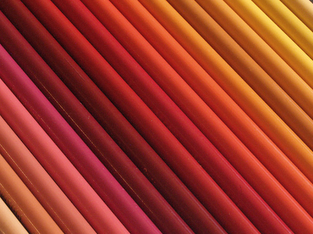
I like this photo! Very nice colours. Good composition (diagonal lines). I know it's stupid but somehow it looks a bit "hazy". As of the lightness was punched up a tad too much. A bit more contrast would be better for my taste. Anyway, still a very good photo.
-stephan |
|
|
|
08/25/2002 01:33:00 AM |
| Trite image... more of a color chart than a photograph. 4 sjgleah |
|
|
|
08/24/2002 04:30:00 PM |
|
|
|
08/24/2002 07:36:00 AM |
|
|
|
08/23/2002 02:06:00 PM |
| the angle ads a nice touch. you have excellent highlights and a nice tonal range in this sharp, clear macro. well done. 9 |
|
|
|
08/23/2002 06:41:00 AM |
| Very simple and effective. lhall |
|
|
|
08/23/2002 06:31:00 AM |
Beautiful abstract art, with nice lighting (glares not too strong) and nice angle on the diagonal.
6, Kavey |
|
|
|
08/23/2002 01:03:00 AM |
| Nice idea. Only thing I see that needs improvement is the reflection of light on the pencils in the foreground. That distracts a little. |
|
|
|
08/22/2002 07:57:00 PM |
nice concept and lovely colours
should take out the light reflection but still nice |
|
|
|
08/22/2002 06:20:00 AM |
| Great color, good choice of diagonal composition. |
|
|
|
08/22/2002 02:32:00 AM |
| very nice array of color. (6) ~mcmurma |
|
|
|
08/21/2002 10:40:00 PM |
Composition: Subject Placement, Cropping, Background9,
Technical: Focus, Exposure, Lighting, Processing9,
Challenge: Does your entry meet it?10,
Appeal: Is it Interesting, Motivating, Etc.? 6,
Total Averaged Rating9. Autool
|
|
|
|
08/21/2002 11:55:00 AM |
| Nice photo. Focus is very good. Seems like it should be just a bit brighter. (probably just me). |
|
|
|
08/21/2002 10:51:00 AM |
| Lovely idea and good execution. Lighting is great except for those slight reflections. |
|
|
|
08/21/2002 10:16:00 AM |
|
|
|
08/21/2002 02:59:00 AM |
| I really love the colours (sorry for the British spelling :-) ! And the slant is perfect. Great picture. |
|
|
|
08/20/2002 03:45:00 PM |
| Visually attractive, stunning in fact. There is something about the angle of the pencils that creates a distortion causing the rectangle to appear unsymmetrical. Sort of parallelogram-ish. This is just odd and causes my eyes to do some quirky things but, it's not actually distracting from the photo. It's a bit griainy and soft (I found that to be a problem for me too this week) and some of the reflection on the pencils to the lower left is distracting. I like this =7 syamjonimi ;'-D |
|
|
|
08/20/2002 02:30:00 PM |
Very nicely done. I like the soft lighting and choice of colors. Perfect composition/lines. Great work! 9
Ruthann |
|
|
|
08/20/2002 11:24:00 AM |
| That is really cool. And it doesn't even matter that there isn't any ONE pencil sticking out because the pattern of pencils and colours speaks for itself. Great job! |
|
|
|
08/20/2002 10:36:00 AM |
| Very pretty. There was one thing that bothered me. Peach and pink aren't in the "prism". However, I looked it up and Prismacolors online and found out that that is the physical name of the colored pencils, so all is good. Very pretty colors, and attractive display of them. you did a nice job keeping glare to a minimum and there are no distracting shadows. It's pretty simple, but very nice. Good luck in the challenge. |
|
|
|
08/19/2002 10:19:00 PM |
| very pleasing to the eye. Not very exciting but well taken and conceived |
|
|
|
08/19/2002 06:46:00 PM |
| This picture makes my eyes just go back and forth over and over it again . 8. |
|
|
|
08/19/2002 05:34:00 PM |
|
|
|
08/19/2002 03:57:00 PM |
| I like the color gradation effect with the pencils. |
|
|
|
08/19/2002 11:58:00 AM |
| I knew somone was ging to take this shot. its hard to tell but it appears a bit dark, Id guess you over compensated for reflections. |
|
|
|
08/19/2002 10:57:00 AM |
| nice but a bit boring, sorry... : ) |
|
|
|
08/19/2002 04:13:00 AM |
| Great image, a real standout effort. |
|
Home -
Challenges -
Community -
League -
Photos -
Cameras -
Lenses -
Learn -
Help -
Terms of Use -
Privacy -
Top ^
DPChallenge, and website content and design, Copyright © 2001-2025 Challenging Technologies, LLC.
All digital photo copyrights belong to the photographers and may not be used without permission.
Current Server Time: 03/12/2025 07:41:17 AM EDT.