| Author | Thread |
|
|
11/19/2002 07:42:00 PM |
| Thanks all for your comments. They will help me in future shots. I am finding out each challenge that each detail needs equal attention every shot: cropping, background, edge content, overall tone, etc. I am starting a checklist, lol. |
|
|
|
11/18/2002 08:07:00 AM |
|
Comments Made During the Challenge  |
|
|
11/17/2002 10:57:00 PM |
| Very cool concept, great composition. Probably the most original shot this week. wingy 10 |
|
 Photographer found comment helpful. Photographer found comment helpful. |
|
|
11/17/2002 10:43:00 PM |
| Interesting patterns made by the arrangement.... I like the similarities and the differences between each one. |
|
| Photographer found comment helpful. |
|
|
11/17/2002 04:43:00 PM |
|
|
|
11/16/2002 02:45:00 PM |
| among the most creative shots this week. who has this many fountain pens? ten for you. |
|
| Photographer found comment helpful. |
|
|
11/15/2002 09:13:00 PM |
| Love the composition and the tonal range. Very nice lighting, wish I could do as well ! Also love the subject, I own many of those myself. lhall |
|
| Photographer found comment helpful. |
|
|
11/15/2002 02:50:00 PM |
| Definitely my favorite this week. |
|
|
|
11/14/2002 08:07:00 PM |
|
|
|
11/13/2002 03:38:00 PM |
| Good composition, but I feel it should be a more "bright and shiny" picture--perhaps more front (top) lighting. |
|
| Photographer found comment helpful. |
|
|
11/13/2002 11:26:00 AM |
| excellent idea, wonderful execution. i will be surprised if this does not do well this week--good luck! |
|
| Photographer found comment helpful. |
|
|
11/13/2002 09:36:00 AM |
| Hey, baby - wanna see my nib collection?! Nice idea and good composition. Makes me want to write... |
|
| Photographer found comment helpful. |
|
|
11/13/2002 08:16:00 AM |
| very cool concept...I only wish the background was lighter so that it would give the pens more definition |
|
| Photographer found comment helpful. |
|
|
11/12/2002 11:04:00 PM |
| Great shot! Focus and set up are excellent. My first 10 of the week. DPz |
|
| Photographer found comment helpful. |
|
|
11/12/2002 07:26:00 PM |
| I have a tin full of old pens. Love this. Different idea. Good focus, good color of background to compliment the different shades of nibs. Great job. 8 PTL |
|
| Photographer found comment helpful. |
|
|
11/12/2002 06:12:00 PM |
| Wow, beautiful job. Congratulations. |
|
|
|
11/12/2002 04:12:00 PM |
| Very nice macro. General interest might be a tad low, but it works well enough for me. 9 Swash |
|
| Photographer found comment helpful. |
|
|
11/12/2002 04:11:00 PM |
| very interesting shot, i like the positioning - 8 |
|
| Photographer found comment helpful. |
|
|
11/12/2002 02:55:00 PM |
| Nicely done, especially the reflections on the pens themselves. |
|
| Photographer found comment helpful. |
|
|
11/12/2002 11:54:00 AM |
| A visually interesting photo |
|
| Photographer found comment helpful. |
|
|
11/12/2002 10:59:00 AM |
| Nice nibs... Good lighting and exposure. I like the presntation. And they asked what you would ever do with all those pens.... |
|
| Photographer found comment helpful. |
|
|
11/12/2002 07:50:00 AM |
| Well done in getting all the nips in focus, a more contrasing background may have been better |
|
| Photographer found comment helpful. |
|
|
11/11/2002 09:52:00 PM |
| Excellent idea! :) I almost did the same shot. |
|
| Photographer found comment helpful. |
|
|
11/11/2002 07:58:00 PM |
|
| Photographer found comment helpful. |
|
|
11/11/2002 07:47:00 PM |
| Great job. I like the textured feel of this photo. jacko 9 |
|
| Photographer found comment helpful. |
|
|
11/11/2002 02:11:00 PM |
| The composition of this is both intriguing and powerful. For some reason, it has a very "tense" feel to me. Great work. karmat |
|
| Photographer found comment helpful. |
|
|
11/11/2002 01:21:00 PM |
|
| Photographer found comment helpful. |
|
|
11/11/2002 01:16:00 PM |
| Good shot. I like the composition of it. |
|
| Photographer found comment helpful. |
|
|
11/11/2002 12:33:00 PM |
|
|
|
11/11/2002 11:20:00 AM |
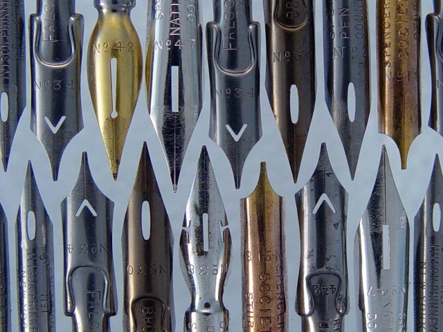
wow, what a great idea ... the thumbnail immediately caught my eye!
challenge -- met
technical -- very well done. maybe just a tad too dark. the cropped off tips at the left are not quite straight, that give the whole shot a slightly tilted look. i also feel that the background color is a little too close to the silver tones of many of the tips. maybe just a little lighter, but not quite white?
composition -- great idea. the arrangement works really well.
-- gr8photos |
|
| Photographer found comment helpful. |
|
|
11/11/2002 10:03:00 AM |
| ohhhhhh my ! I love this !!!!! Awesome !!!!!!!!!!!!!!!!!!!!! = 10 Shiiizzzam |
|
|
|
11/11/2002 08:14:00 AM |
| Awesome photo... Possibly top 3? |
|
|
|
11/11/2002 07:33:00 AM |
| great negative spaces! Very graphic, like it a lot - why did you pick grey for the background colour ? |
|
| Photographer found comment helpful. |
|
|
11/11/2002 06:35:00 AM |
I see your point haha Great Shot
Diana |
|
Home -
Challenges -
Community -
League -
Photos -
Cameras -
Lenses -
Learn -
Help -
Terms of Use -
Privacy -
Top ^
DPChallenge, and website content and design, Copyright © 2001-2025 Challenging Technologies, LLC.
All digital photo copyrights belong to the photographers and may not be used without permission.
Current Server Time: 03/12/2025 01:33:12 PM EDT.