| Author | Thread |
|
|
12/18/2002 05:25:14 PM |
CRITIQUE CLUB COMMENT
by karmat
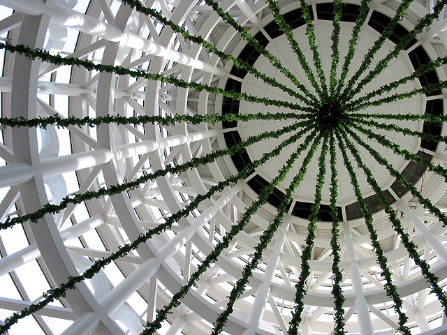
Composition -- The composition of this is really strong, I think because you stayed away from the center of the frame. The green "tree" things all lead to one point effectively guiding the eyes to the one focal point from anywhere in the frame. For some reason, though, I feel like it is almost too close to the top and right of the frame. Maybe if the focal point was moved in and down just a touch. But, then again, that is so minimal, it may just be me. I really like the way the straightness of the poles/supports contrasts with the "roundness" of the tree as well.
Technique -- The focus is wonderful as you can make out details all the way up and into the tree. Also the exposure is right on because the whites are bright, yet not blown out. Nothing I can suggest to make this better. It is a very well done picture. The simplicity of the colors is also very captivating.
Overall effect -- Though it is a very good picture, without the title, I would have been lost as to what I was looking at. Not that it matters, obviously, but I think sometimes if we choose subjects that our audience relate to immediately, they respond better. Having said that, the title is very appropriate, both for the picture and the season. This is one of those shots that makes me want to visit places and see the thing in person. (Just noticed you had nothing below 4, way to go. that has got to be a dpc record or something!) |
|
Comments Made During the Challenge  |
|
|
12/15/2002 04:29:00 PM |
| Great choice of framing and kudos for having the imagination to look up! I like it a lot. |
|
|
|
12/15/2002 10:12:57 AM |
| Technically a nice picture, but it leaves me kind of empty on the interest side of things. Maybe this would have been a time to forget the thirds thing and go for the whole effect and center it in your frame. It is a kind of vertigo shot, so go for the gusto. |
|
|
|
12/15/2002 07:56:55 AM |
| Lines and shapes make for wonderful pics. Add a little holiday color and voila! Great subject, composition and well taken - Inspzil |
|
|
|
12/14/2002 08:33:18 AM |
| I like that you chose to put it over to one side. Great radiating spokes! |
|
|
|
12/13/2002 11:44:08 AM |
| I like your composition and the repeating of lines and angles - makes it a very interesting shot. I also like the limited color palette. Wonderful imagination to choose this angle and composition! lhall |
|
|
|
12/13/2002 12:26:27 AM |
| Interesting geometric study. The lighting is very nice on those white girders. The strands of green stuff make me feel like I'm trapped in a net or something! Very dramatic composition, and overall and effective photo. |
|
|
|
12/12/2002 08:59:03 PM |
| One of four tens. I REALLY like the perspective, and the quality is phenomenal. Good job! |
|
|
|
12/12/2002 07:22:35 PM |
| Cool patterns. It took me a little bit to figure this one out. It's kind of an interesting abstract. 7 Swash |
|
|
|
12/11/2002 08:41:05 PM |
| What a unique picture! Great patterns and contrast. |
|
|
|
12/11/2002 02:31:20 PM |
| Superb photo - very unusual perspective, and good use of the RoT. However, given the concentric ring patterns of this structure, a centred shot might also work well in this case. |
|
|
|
12/11/2002 01:16:34 PM |
| I like it. Interesting because I can´t say exactly what it is. Perhaps some Christmas-things hanging from a roof? Never mind - it´s a good composition, maybe a little tight framed up and right. I would like a little more air round the black circle. (But I´m not THAT sure.) Overall a great shot. (7) |
|
|
|
12/11/2002 01:12:43 PM |
| i guess they were still putting it up? i like the perspective but the colors, subject matter, dont do much for me |
|
|
|
12/11/2002 12:18:37 PM |
| Compositionally, this is really a cool shot, even if a little busy. I'm wondering if it's oversharpened a little or if that's just the texture of the greenery. Awesome choice to offset this image to the top right. |
|
|
|
12/10/2002 11:29:22 PM |
I got kicked out of the mall for trying something similar heh...
love the pattern here... nice vision |
|
|
|
12/10/2002 09:46:16 PM |
| Great clarity in this shot. The composition is good as well as your white balance. Nice abstract. |
|
|
|
12/10/2002 09:09:45 PM |
| Interesting..... very feminine, somehow. I like the way you chose to place the vertex off center. The colors are nice, too. |
|
|
|
12/10/2002 08:42:31 PM |
|
|
|
12/10/2002 07:30:35 PM |
| Wouldn't want to have to be the one who puts the angel on top! lol Great perspective. |
|
|
|
12/10/2002 03:23:34 PM |
| Cool perspective and cool abstract shot. Very nicely cropped, framed. Good color, light, focus. |
|
|
|
12/10/2002 01:05:26 PM |
| A very nice composition, especially the arangement of the pinicale of the structure in the upper right conner. Great colours and detail as well. I personally don't find anything outside of the technically well done composition and execution; it is not emotional for me. A great job, nevertheless. |
|
|
|
12/10/2002 10:32:49 AM |
| I really like the patterns here, with the Christmas decorations repeating the architectural pattern. I like the circle off center in the upper right, but I think I would have liked a little more space to the right and above the green circle. Nice job with the lighting! |
|
|
|
12/10/2002 12:15:30 AM |
| What very interesting patterns. Has just enough color to make it interesting as well. I love the placement of the main focal point. Our eyes are drawn there very nicely. Treat to not have it centered. Focus and clarity are good. It's hard to tell exactly how big this is. Looks really really big to me, but the perspective is that which could be taken wrong. almost looks like windows up there at the top. anyway, a very interesting find. good luck in the challenge. |
|
|
|
12/10/2002 12:06:19 AM |
| Composition and lighting are really nice. Good abstract. DPz |
|
|
|
12/09/2002 11:16:34 PM |
| Perfect use of the rule of thirds and very unique. I love the colors. White just makes every photo look better in my eyes. Great detail and stucture. Very nicely focused. |
|
|
|
12/09/2002 09:39:30 PM |
| Great shot. I don't even know what to say about it, it just looks great. |
|
|
|
12/09/2002 09:20:29 PM |
| either more color or more silouhette might improve the photo. nice composition and angle. |
|
|
|
12/09/2002 08:59:11 PM |
| Great colours and curves. Love the angle of thiss hot. 9 Jacko |
|
|
|
12/09/2002 05:52:53 PM |
| I love the lighting and patterns here. I can't think of anything to make it better = 10 |
|
|
|
12/09/2002 03:32:39 PM |
| A unique perspective... Very nice lines and an interesting shot. |
|
|
|
12/09/2002 12:51:29 AM |
| Wow! I really like the lines in this shot. And the colors are great too. |
|
Home -
Challenges -
Community -
League -
Photos -
Cameras -
Lenses -
Learn -
Help -
Terms of Use -
Privacy -
Top ^
DPChallenge, and website content and design, Copyright © 2001-2025 Challenging Technologies, LLC.
All digital photo copyrights belong to the photographers and may not be used without permission.
Current Server Time: 03/13/2025 03:45:15 PM EDT.