| Image |
Comment |
| 10/29/2002 12:15:00 AM |
Popped Topby greenem2Comment: My highest scorer so far. Great job with the execution. The idea is simple. The shot is technically excellent. Clean. No complaints. ~indigo997 |
 Photographer found comment helpful. Photographer found comment helpful. |
| 10/29/2002 12:44:00 AM |
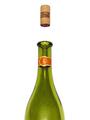
'69 Camaroby HBunchComment: heehee. It isn't a pic of a pic?? WHOAA!! The frame isn't completely straight so I would think the silly folks could get it. DUH! I don't like the folds in the bg. Illusion achieved tho! ~indi |
| Photographer found comment helpful. |
| 10/29/2002 12:37:00 AM |
A New Balanceby karmatComment: Cool. I like that you put the light on top (bottom). There are several photos with the same general idea, but I think you did a good job with it. I would like to see more of the chair and less space above the shoes maybe. ~indi |
| Photographer found comment helpful. |
| 10/22/2002 12:21:00 AM |
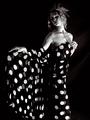
Transcendby AleciaComment: This photo is so glamorous. I want pics like this of me! The way the fabric is so sheer that you see double circles in spots is a little distracting. Makes me feel like I'm seeing double somehow. Otherwise, this is a perfect shot. Excellent use of lighting. If you were to do it again and could use more lighting tho, u might fill in some on her face so that it isn't quite so dark. Love the pose. 10 ~indi |
| Photographer found comment helpful. |
| 10/22/2002 11:27:00 PM |
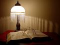
Two Lamps...by nards656Comment: Nice lighting. Cool lamp. I like the shadows, but it'll hurt your eyes to read with that light. Don't ya know?? ~indi |
| Photographer found comment helpful. |
| 10/22/2002 01:05:00 AM |
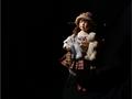
Puppet Stageby MiekaComment: Nice lighting and negative space. Maybe you could have blocked the light somehow to keep it from lighting the background on the right side. Good focus too! ~indi |
| Photographer found comment helpful. |
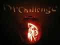
| 10/22/2002 12:39:00 AM |
The Grim Reaperby NitenComment: REALLY cool jack-o-lantern. Wanna come do mine for me? Did u try a different f# to get the words in sharper focus? Maybe it isn't possible - did u use a candle or light? A flickering candle would have made that really hard I guess. I like the color of the pumpkin. Tryin to think of suggestions...maybe you could have somehow made the bg darker. Used a black fabric or something? I dunno, but it's darn good as is. 7 ~indigo997 |
| Photographer found comment helpful. |
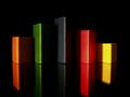
| 10/21/2002 10:13:00 PM |
Triscapeby FrooberComment: I really like this. The colors and lines are cool. Nice use of lighting. I'd prefer to have the "top" of the reflections in the shot tho. Also, why is there a double edge on the reflections? It looks like a movement blur and tricks my eyes. Very strange ;o) ~indi |
| Photographer found comment helpful. |
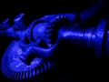
| 10/21/2002 02:46:00 AM |
GearWerkzby mcmurmaComment: Cool perspective. I like the color and you did a nice job with the lighting. I like when the subject fades into the bg. The subject just doesn't do a lot for me. Great technically, very good at meeting challenge....I couldnt come up with a good subject either ;oP ~indi |
| Photographer found comment helpful. |
| 10/22/2002 01:00:00 AM |
Lit upby GotchaComment: Don't quite understand the title. This is a funny picture tho. I suck at comments. ~indi |
| Photographer found comment helpful. |
Home -
Challenges -
Community -
League -
Photos -
Cameras -
Lenses -
Learn -
Help -
Terms of Use -
Privacy -
Top ^
DPChallenge, and website content and design, Copyright © 2001-2025 Challenging Technologies, LLC.
All digital photo copyrights belong to the photographers and may not be used without permission.
Current Server Time: 04/22/2025 06:26:28 PM EDT.