| Image |
Comment |
| 06/06/2003 02:14:38 PM |
Hydrargyrumby dadas115Comment: I love the action in this photo! There's a lot going on visually, and I like the metallic feel as well as the shadows under the drops. The composition is nice, too, very active and unusual. I'm more and more impressed, the more I look at this! The ONLY thing I can think of to suggest is perhaps to add some color in the background, where it's white. If that's possible. Nice work! |
 Photographer found comment helpful. Photographer found comment helpful. |
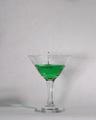
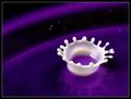
| 06/06/2003 02:09:42 PM |
Bloop!by hockeyfanComment: My most favorite thing about this image is the action captured. The contrast of the two colors is also nice, adds interest. Minus: the lighting. Because it's not very warm, it washes out the background and looks like paper rather than a background. Oh, the shadow with the green in it is also very nice! |
| Photographer found comment helpful. |
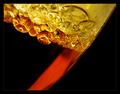
| 06/06/2003 02:07:48 PM |
Oil & Vinegar Abstractby jerrftComment: I like this image because of the harmony of the two substances in real life (a natural mixing of liquids), plus the colors are rich and the bubbles are clean. There's quite a bit of black in this photo, which might hurt you a little but looks fine on my monitor. I like the border, daring of you to go black-on-black but it works! |
| Photographer found comment helpful. |
| 06/06/2003 02:06:08 PM |
Transfusionby moodvilleComment: Pluses: I like the concept, the background is clean and non-intrusive, the composition is pretty solid. Minuses: the lighting is a bit harsh/uneven for my taste, and the glass is SO sweaty it looks like it's been there a while. Might have been your intention but to me it says "this is shot #150 of this setup," which ruins the sort of "just happened upon this scene" feel. |
| Photographer found comment helpful. |
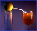
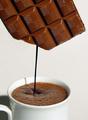
| 06/06/2003 02:02:41 PM |
liquid chocolateby miss parkerComment: I like this image a lot, but it's a little too easy to figure out how you did it because the colors aren't quite matched up. A thicker stream of the chocolate would help -- also, I'd bring the left side out a bit so the cup handle's not cut off. Overall, though, the feel is engaging and appetizing! |
| Photographer found comment helpful. |
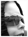
| 06/05/2003 11:51:40 AM |
House of the Rising "Son"by orussellComment: Hello there! Since in the "comments" thread you mentioned that you wished you'd had more constructive comments, I'll leave one of my trademark super-wordy "this is good but that could be better" comments for you. :)
What I liked a lot: the expression on the kid's face, the joy that comes across, made it feel like home SWEET home. The reflection is really clean. It definitely meets the topic. Oh, and the use of the hood was good for framing the image and directing the eye inward.
What I liked less: the upper right is SO white it feels harsh, and because it blends into the border there's no contrast up there. The sunglasses, while I understand the necessity for using them to capture a large enough reflection, are too big for his face and that distracted me for a second. The cropping would have been improved, I think, by going a BIT lower so it didn't look like he was biting the bottom edge of the photo. :) And I might have brought the right edge in a little to minimize the stark white. Finally, I'm personally not fond of portraits of people I don't know, but that's my own prejudice and has nothing whatsoever to do with the quality of your photo.
So there you have it. :) I gave this photo a 6, which is my "meets the challenge and has nothing particularly negative about it but doesn't leap ahead of the pack for me either" score. Hope that helps! |
| Photographer found comment helpful. |
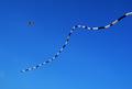
| 06/05/2003 02:19:14 AM |
Floatingby johnmkComment: The blue is very rich and clean, but I don't see the "liquid" connection. The motion of the string appears to be rather fluid, but to me that's just not the same thing as liquid. Sorry... |
| Photographer found comment helpful. |
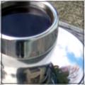
| 06/05/2003 02:17:45 AM |
Smooth black coffeeby peter_kComment: This image would be interesting if it weren't so very out of focus! I don't know if that was deliberate, but it doesn't work for me personally. I think of coffee and I think of crisp, alert, snapping to attention. This is a little too dreamy for my taste. |
| Photographer found comment helpful. |
| 06/05/2003 02:14:59 AM |
Dairy Queen by crabappl3Comment: Knew there'd the the requisite droplet in here somewhere (not that I know how to shoot one myself). I think what really makes this photo unique is the use of color. What a dramatic shade! In the land of allowable spot edits, the specks in the black band should probably go, but overall everything, even the reflection, is so precise and beautiful! Nice work! |
| Photographer found comment helpful. |
| 06/05/2003 02:12:20 AM |
Iced Cap chillin at the beachby DCThiessenComment: There's something so playful about this image! I love the perspective, and how it almost makes the iced cap feel like it's being humanized. It's probably accidental, but I also like how the clouds sort of feel as though they've floated right out of the straw and into the sky. A fun representation of liquid as beach-dweller, and a very nice shot from a technical standpoint! :) |
| Photographer found comment helpful. |
Home -
Challenges -
Community -
League -
Photos -
Cameras -
Lenses -
Learn -
Help -
Terms of Use -
Privacy -
Top ^
DPChallenge, and website content and design, Copyright © 2001-2025 Challenging Technologies, LLC.
All digital photo copyrights belong to the photographers and may not be used without permission.
Current Server Time: 04/22/2025 05:48:51 PM EDT.