| Image |
Comment |
| 05/19/2003 06:03:54 AM |
Face Offby magnetic9999Comment: Harsh lighting - don't much like those very bright reflections. Also i think this kind of shot needs very careful setting-up. With no other subjects whatsoever, the not-quite-symmetrical positioning is distracting. |
 Photographer found comment helpful. Photographer found comment helpful. |
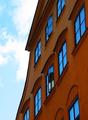
| 05/19/2003 05:58:27 AM |
Reflectionsby mbardeenComment: Good capture - and good thinking. The non-frelected skyy ruins this for me though - especially that green/blue cast from being slightly over-exposed (this may just be a personal bugbear of mine. Did you try cropping it out? I'd have thought that just the building and windows, with that one slightly open window to upset the regularity, would have made a fabulous shot. Good wrk, nevertheless. |
| Photographer found comment helpful. |
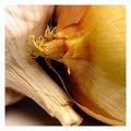
| 05/19/2003 05:54:58 AM |
sweet & sourby Pep VentosaComment: That red cloth allows the green to really jump out, but it has a muting effect on the red apple - still think it's a good shot, but did you try other background colours? Like a rich deep blue, almost black is what I'd have tried. Nice shooting |
| Photographer found comment helpful. |
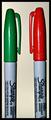
| 05/19/2003 05:48:13 AM |
|
| Photographer found comment helpful. |
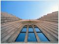
| 05/17/2003 07:01:16 AM |
Pool of Glassby finnurComment: This is SUCH a good shot - I'm hugely envious. Didn't vote on the challenge, so din't see it until now. Fabulous work
|
| Photographer found comment helpful. |
| 05/16/2003 08:31:10 PM |
Love Storyby ursulaComment: Lovely shot - great detail, texture, light ... pity about the graininess, and a real shame that i can't see that it meetws the challenge in any real sense. I guess at a push you could claim 'orange' for the one on the right ... |
| Photographer found comment helpful. |
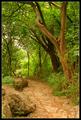
| 05/16/2003 08:08:39 PM |
Path Through the Greensby paganiniComment: I hope you understand when i say that this seems to be more about the path than the greens - or perhaps the tree trunk. It's a lovely photo, especially the texture of that three trunk - but the interest for me is all in the non-green stuff. Had it been me, I'd perhaps have under-exposed a stop or so, just to saturate the colours more - but then the muted contrasts here are such a strong part of the image. |
| Photographer found comment helpful. |
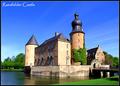
| 05/15/2003 06:00:57 AM |
Raesfelder Castleby kiwinessComment: Critique Club
I don't think there's much to criticise here! It could be sharper, and for me perhaps a fraction shorter exposure to hold the burnt out sections, but it's really a very good postcard shot. I think photographed a little earlier or much later in the day might give you more warmth and gentleness from the light, but catching it with the sun level with that side wall has a good effect in it's own right.
Control over the sky colour is excellent - did you use a graduated filter for it? Given the brightness of the castle, I would have expected the sky to have lost more tone than that.
Excellent work.
ed |
| Photographer found comment helpful. |
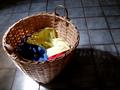
| 05/15/2003 05:36:53 AM |
Recurring Primariesby MalokataComment: By far the best of a really not impressive set of entries - geat lighting, though the slight over-exposure is a minor issue: that yellow's bleached out quite a lot, though obviously much shorter a shutter would perhaps have left the dark too dark. Texture on the basket is wonderful. |
| Photographer found comment helpful. |
| 05/15/2003 05:25:09 AM |
Primary Coatrackby myqylComment: Whoa, steady on the bordering there! way too much ... Nice photo behind that, but it really distracts from it. |
| Photographer found comment helpful. |
Home -
Challenges -
Community -
League -
Photos -
Cameras -
Lenses -
Learn -
Help -
Terms of Use -
Privacy -
Top ^
DPChallenge, and website content and design, Copyright © 2001-2025 Challenging Technologies, LLC.
All digital photo copyrights belong to the photographers and may not be used without permission.
Current Server Time: 04/07/2025 09:09:41 AM EDT.