| Image |
Comment |
| 04/30/2005 02:07:30 PM |
|
 Photographer found comment helpful. Photographer found comment helpful. |
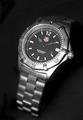
| 04/30/2005 02:07:05 PM |
Tag-Heuerby michael_pComment: soft focu on the lower band detracts from the commercial nature of the challenge. Good lighting and background though |
| Photographer found comment helpful. |
| 04/30/2005 02:05:54 PM |
Breakfast at Tiffany'sby OFreasierComment: Nice layout with the boxes, but your subject (the bracelet) is not displayed in an eye catching way. better to have kept it all in the box as the DOF isn't clear the way you have it now |
| Photographer found comment helpful. |
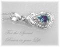
| 04/30/2005 02:04:06 PM |
For that special someoneby trainComment: pendant is blown out and you cant distinguish between the background and the silver of the pendant. Nice layout and lettering, but this doesn't make me want to buy the item. |
| 04/30/2005 02:02:58 PM |
|
| Photographer found comment helpful. |
| 04/30/2005 01:56:47 PM |
Defining Beautyby arnitComment: too much model not enough focus on the jewelry, the subject of the challenge. Too bad because these look like interesting pieces |
| 04/30/2005 01:54:32 PM |
|
| 04/30/2005 01:46:20 PM |
Surprise Herby BradComment: Nice image of the earing, but having a person where the jewelry detracts from the intent to sell the jewelry. Overall this is an excellent photo, but it doesn't work as a jewelry ad in my opinion. The details on the model (hair, freckles and skin) overwhelm the subject of the image the earring |
| Photographer found comment helpful. |
| 04/30/2005 01:43:39 PM |
|
| Photographer found comment helpful. |
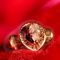
| 04/30/2005 01:42:28 PM |
Iceby bruskiComment: Lettering is too light, and the photo of the ring is too soft. Great layout though and I like the lighting with the slight shadow under the right side of the ring. It give the image more depth. 5 |
| Photographer found comment helpful. |
Home -
Challenges -
Community -
League -
Photos -
Cameras -
Lenses -
Learn -
Help -
Terms of Use -
Privacy -
Top ^
DPChallenge, and website content and design, Copyright © 2001-2025 Challenging Technologies, LLC.
All digital photo copyrights belong to the photographers and may not be used without permission.
Current Server Time: 04/22/2025 05:37:39 PM EDT.