| Image |
Comment |
| 08/19/2002 10:02:00 AM |
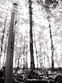
Small Timberby hokieComment: This is beautiful. One of 6 10's this week. Black and white is awesome. I think that if it had been in color, it would have taken away from the "likeness" of the pencil to the tree. Yes, I like the background being oof. Is that an ant making it's self at home on your pencil? Alternate title could be "like father like son". lol. Great lighting, great angle, focus, appeal. Excelent shot and good luck with the challenge. |
| 08/20/2002 05:53:00 PM |
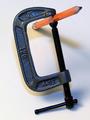
Pressure Pointby rll07Comment: It took me a minute to figure this out. It's really neat. Lighting and angle are good. I like how it fits in the frame. Very clever and unique. Another idea is to use a carpenters pencil. I think it would look cool that way too. I like the simplicity of this. It's not too busy and it's a neat balance. You did a nice job of getting in close on this. Don't know if too many people will realize it's only a 2" c clamp. Great job and good luck with the challenge. |
| 08/19/2002 07:42:00 PM |
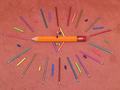
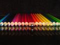
Puuurdy Pencilsby evmariedogsComment: This is very pretty. I would love to see the patterns you went through to get this one. the lighting is great. no distracting shadows or bright spots. I think it would have a slight bit more artistic appeal if you had taken the time to space evenly and arrange colors. There are 2 yellow things down in the bottom left and no other yellow around the circle. In the triangles in the middle, there are 2 yellow erasers in the bottom triangle, and a yellow and a blue eraser in the top triangle. You did a great job of pattern though. Pencil, chalk, pencil, eraser. All the way around. I also like the color of the background. Makes the colors of the chalk, pencils and erasers stand out. Nice job and good luck in the challenge. |
| 08/21/2002 01:12:00 PM |
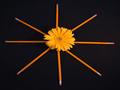
Petalsby kathleenmComment: The dark background works well with the yellow subjects. It is creative and original. The colors are beautiful and the placement within the photo is very nice. May have had a higher visual impact if the Pencils were a bit more straight. The 2 horizontal pencils are pretty straight across from each other, but the vertical ones kind of zig zag. Over all great photo. Good job and good luck in the challenge. |
 Photographer found comment helpful. Photographer found comment helpful. |
| 08/25/2002 11:32:00 PM |
Obvious Imposterby syamjonimiComment: sorry I haven't commented on this sooner, been a busy week. I really like this photo. The only thing that is a little irritating, is my totally annoying ability to recall useless information at any given moment. The fact that the way you have these lined up doesn't match the "proper" order of color really hits me hard with this photo. That is TOTALLY not your fault. Completely mine. In other words, I'm not holding against you, just making an observation. And purple is missing. Anyway, I DO love this photo though. It's very colorful and I love the multiple reflection. You have great light and great light control. Focus and frame placement is great. I would love to see this again with the colors in a different order and with purple. Please don't take that the wrong way, I honestly think I'm obsessive compulsive or something. My son has it too. Great photo and good luck in the challenge. |
| 08/20/2002 10:13:00 PM |
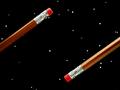
phantom colorby wheatabixComment: Really really cool. I hope you let on as to how you did this when voting's over. I think I may know how the other "floating pencils" were done, but this one puzzles me. It is very visually appealing. Lighting and angle are good. don't think there is much more I can say about this. Nothing really distracting. I think the shadow from the pencil kind of makes my eyes go off the page, but I don't think it would be the same without the shadow. I think it's important. Great photo and good luck with the challenge. |
| 08/19/2002 10:10:00 PM |
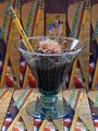
Ticonderoga with a Twistby JEFFCOWLESComment: I get the point, but I think with all the boxes, it's a little busy. I love the idea. Vocus and lighting are good. No disturbing shadows, and dealing with glass you kept the glare and reflection down nicely. It actually almost looks yummy. Almost. Great job and good luck with the challenge. |
| 08/22/2002 10:13:00 AM |
One of a Kindby bdshortComment: The yellow #2 definately stands out in this photo. The others look like those environmentally friendly pencils that are made out of recycled materials. I wonder if you did the angle on purpose that way. I'd like to see a comparrison of this photo to a photo of them head on with no diaganal tilt. There is kind of a curved look to the pencils to the bottom of the photo. I think it's only a trick on the eyes though due to the angle cause when a ruler is placed up to it, it sure enough is straight. Very nice display of pencils. Good luck in the challenge. |
| 08/24/2002 12:56:00 AM |
Negative Space Odysseyby FrooberComment: Cool effect. I like the idea. Placement and angle are good. Lighting and focus are great. The only thing that stands out to me as odd is the blemish in the eraser at the bottom right of the photo. unless the rest of the eraser is like that or worse, maybe rotating the pencil to a different spot of the eraser could have avoided showing this. The background is absolutely great. Very nice job and good luck in the challenge. |
| Photographer found comment helpful. |
| 08/25/2002 11:56:00 PM |
Rhythm and bluesby JeanComment: not really sure what this is. I assume the reflections are pencils. so in that matter, I assume it meets the challenge. great effects though and lighting, color and angle are great. frame placement is very nice. good luck in the challenge. |
Home -
Challenges -
Community -
League -
Photos -
Cameras -
Lenses -
Learn -
Help -
Terms of Use -
Privacy -
Top ^
DPChallenge, and website content and design, Copyright © 2001-2025 Challenging Technologies, LLC.
All digital photo copyrights belong to the photographers and may not be used without permission.
Current Server Time: 04/21/2025 05:57:01 AM EDT.