| Image |
Comment |
| 08/17/2003 11:59:46 PM |
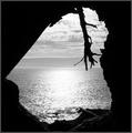
Beyond The Grottoby Faye PekasComment: I love it. The lighting, the mood and the view... Well done, my highest rated photo. 9 I bet this is a ribbon winner... |
 Photographer found comment helpful. Photographer found comment helpful. |
| 08/17/2003 11:56:12 PM |
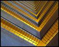
Shyby robsmithComment: Interesting I like the Idea and am intriguied by how this was done. The only thing I dont like is the blown out window to the right. But I know how much of a pain that can be so wont subtract for it due to the excellent idea. Nice job. 7 |
| 08/13/2003 01:28:20 AM |
|
| Photographer found comment helpful. |
| 07/30/2003 02:14:05 PM |
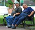
A growing trend. by DiversqComment: Thanks for all the great comments. When I shot this I didn't notice the edge of the bench being out of the frame, I wish I did because it annoys me too. Ahh well chalk that up as another learning experience from DPC. |
| 07/30/2003 11:58:12 AM |
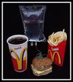
Fast Food, Slow Deathby GolferDDSComment: I love the intravenous bag. I have often wished I could set one of those up by my desk at work and fill it with some delicious ice coffee. Of course I could take that one step further and have a cathader put in that way I wouldn�t have to get up so often.
Anyhow nice shot and good idea, really fits the challenge. I think your shot shows the beginning and my shot shows the end result.
|
| Photographer found comment helpful. |
| 07/27/2003 10:48:06 PM |
Ice Kissby hawkidaComment: <-- Critique Club -->
Here�s the Critique you requested.
The idea of this photo is good but its difficult to figure out what your seeing. The point where the 2 ice cubes are "kissing" is being over shadowed by the blackness of the background and what seems to be another cube to the left.
Perhaps if you pulled back a little farther to show more of the top ice cube that may help. Also if you brightened up the photo all together that might help too.
Good luck on future challenges.
Diversq
|
| Photographer found comment helpful. |
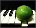
| 07/27/2003 10:19:04 PM |
Sour Noteby dsidwellComment: Very Very Cool... I love the color contrast. I would never have thought to do this and it is an excellent take on the challenge. The photo is great and the title really adds to it. Great job.. 8 from me |
| Photographer found comment helpful. |
| 07/25/2003 01:30:34 PM |
|
| Photographer found comment helpful. |
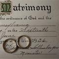
| 07/25/2003 10:16:36 AM |
The Rings of Eternityby OneSweetSinComment: <--Critique Club -->
Hello Sweet Sin,
I like this photo overall. The certificate in the back and the rings look good and I like the texture of the paper a well.
I have to agree with some of the other comments however about the photo being kind of flat. Its not necessarily a bad thing but I think if you had adjusted the angle a bit down and to the left, it may have given more depth to the certificate.
The cropping is just a bit tight for my taste. I would like to see a bit more space next to the M on the left. Not centering matrimony but just giving a bit more room for it.
As an after thought perhaps you could show the color of the rings against the cert. Maybe getting a gleem or something.
I do like the photo and if you decide to shoot this again trying some different angles and lighting, I would like to see what you come up with, so PM if you do.
Good luck on future challenges.
Diversq Message edited by author 2003-07-25 10:24:59. |
| 07/23/2003 03:01:36 PM |
|
| Photographer found comment helpful. |
Home -
Challenges -
Community -
League -
Photos -
Cameras -
Lenses -
Learn -
Help -
Terms of Use -
Privacy -
Top ^
DPChallenge, and website content and design, Copyright © 2001-2025 Challenging Technologies, LLC.
All digital photo copyrights belong to the photographers and may not be used without permission.
Current Server Time: 03/12/2025 07:42:08 AM EDT.