| Author | Thread |
Comments Made During the Challenge  |
|
|
08/24/2002 02:12:00 AM |
| Very stylish --beautifully photographed--I love this---andrewm |
|
|
|
08/23/2002 04:15:00 PM |
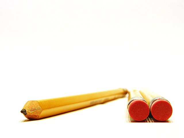
| I don't understand the title, and I looked it up on the internet and couldn't find anything except that v.00 stood for Volume 00. Oh well, this isn't a title contest, so who cares if I don't get it. Also, there is an Administrator's Note that there is not border and it's legitimate. I have no idea what that means either, so again, who cares. Neither has to do with the photo it's self anyway. Which, by the way, I like very much. I like the angle and how you have the contrast with the tip and the erasers. The lighting is great and placement is very nice as well. Only complaint I might have is the strange shadow under the erasers. looks strange for some reason. Overall great photo. Good luck in the challenge. |
|
|
|
08/23/2002 09:29:00 AM |
Why can't I add photos to my favourites list when voting?
I just LOVE this picture. I adore the two circles and the angled line next to them. I love the colours. I just LOVE the massive white space above them. I love the DOF and the colour and the lighting and the background. I really really really like this:)
I really really wish I could say "I took that" about this one.
Joint favourite this week and one of my site favourites too.
10, Kavey |
|
|
|
08/23/2002 02:58:00 AM |
| great great photo, one of the few that doesn't make me want to put the pencil in my eye |
|
|
|
08/22/2002 07:53:00 PM |
|
|
|
08/22/2002 04:43:00 PM |
|
|
|
08/22/2002 11:57:00 AM |
| great perspective .. light's a little harsh but i think you wanted that effect. |
|
|
|
08/22/2002 03:10:00 AM |
| this looks photoshopped ;P great dof and composition...if i really had a thing for pencils...i'd hang this on my wall 10 Lisa |
|
|
|
08/21/2002 03:56:00 PM |
| This is kind of interesting, bt there is too much blank space at the top. |
|
|
|
08/21/2002 03:47:00 PM |
| Great focus and lighting. I love the minimalism of this shot. |
|
|
|
08/21/2002 01:34:00 PM |
| Great shot. This is one of my favorites this week. 8 |
|
|
|
08/21/2002 09:25:00 AM |
Composition: Subject Placement, Cropping, Background8,
Technical: Focus, Exposure, Lighting, Processing9,
Challenge: Does your entry meet it?10,
Appeal: Is it Interesting, Motivating, Etc.? 7,
Total Averaged Rating9. Autool
|
|
|
|
08/20/2002 04:21:00 PM |
| great image. strong composition with strong impact. i fear you might get slammed for this though. not everyone appreciates this style. i'm sure you will get many simple critiques on what you did wrong. stylistically i love this. i really like the blown out background. i hope you do well in the challenge. if not, hang in there. you have achieved a pretty unique style which is a rarity on this site. 9 |
|
|
|
08/20/2002 03:33:00 PM |
| Very nice. Great perspective! |
|
|
|
08/20/2002 03:14:00 PM |
| wow, we do have a lot of admin notes this week. i just totally love your photo. the composition is awesome, although i can see why some people think it's a border, i'm sure you will enlighten us on monday as to how you achieved the effect. very nice selective DOF, and placement of the pencils, but i probably would've chosen a 640x427 format to just slightly reduce the negative space w/out loosing the concept. also, your paper is ever so slightly wavy under the diagonal pencil. but i'm just nitpicking here. my top 5 this week. -- gr8photos (10) |
|
|
|
08/20/2002 02:41:00 PM |
Very simple, clean and well done. Great composition and angle. I like it very much. The choice of exposure suits this photo well. Great work. 10
Ruthann |
|
|
|
08/20/2002 02:26:00 PM |
| I love the technique, I love the shot. |
|
|
|
08/20/2002 10:45:00 AM |
| this is a really neat concept but it looks like it was cut and pasted into a new white frame in software... this is illegal... I score the shot an 8 just incase it is legal though... good idea :) - jmsetzler |
|
|
|
08/20/2002 06:19:00 AM |
.
Message edited by author 2003-09-19 03:16:22. |
|
|
|
08/20/2002 12:35:00 AM |
That's pretty doggone cool. The title is good too and I see it depicted in the shape of the pencils. I love how the pencils fade into blurriness and are very sharp in the foreground. Wonder how you did this; would like to learn this technique. I'm impressed. 7 for now for my first round of voting but will definitely re-visit lateron this week. Congrats. Journey
Update: The stark simplicity of this image really makes a lot of impact on me. Technically and artistically a great image. 9 Journey
Final score: 10 Journey |
|
|
|
08/19/2002 09:47:00 PM |
| I like the simplicity and position here of the pencils, but I must say I find the shadow under the paif of pencils a bit distracting. The end of the pencil looks fine, but the shadow looks a bit choppy. |
|
|
|
08/19/2002 06:57:00 PM |
|
|
|
08/19/2002 02:12:00 PM |
| I like this photo a lot. I would like it much more if the reflections of the pencils were not cropped / chopped at the bottom of the photo. If you cropped this differently, you'd get those back and get rid of some of the shadows at the top too. Just an opinion. Great photo! |
|
|
|
08/19/2002 10:20:00 AM |
| Very minimalist. Works well. Love the composition and the setup. Not high impact, but still a terrific shot. lhall |
|
|
|
08/19/2002 02:41:00 AM |
| The cropping of the reflection/shadow in the bottom right corner is somewhat distracting, but this is an otherwise nice photo. 6 -lennier |
|
Home -
Challenges -
Community -
League -
Photos -
Cameras -
Lenses -
Learn -
Help -
Terms of Use -
Privacy -
Top ^
DPChallenge, and website content and design, Copyright © 2001-2025 Challenging Technologies, LLC.
All digital photo copyrights belong to the photographers and may not be used without permission.
Current Server Time: 03/12/2025 10:56:19 PM EDT.