| Image |
Comment |
| 04/08/2002 12:28:00 AM |
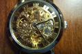
Skeletonby fsearlesComment: A better surface/backdrop for the watch would make this much nicer. |
| 04/08/2002 01:30:00 AM |
|
| 04/08/2002 12:19:00 AM |
|
| 04/08/2002 01:13:00 AM |
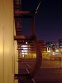
Urban Curvesby pdb209Comment: Nice enough, but seems stretched somehow; the chromatic aberrations in the lights of the building behind make it look very fuzzy. |
| 04/08/2002 12:24:00 AM |
His and Hersby ngoudyComment: I wish I didn't want to mark this down for all the JPEG artifacting, but it's so distracting on this shot. |
| 04/08/2002 12:32:00 AM |
|
| 04/08/2002 12:33:00 AM |
Between a Rock and ... Another Rockby zymaraComment: Ouch! This shot is very washed-out. I can't even make out the roof of the building, or the reflections in the rock. Try turning down the white balance on your auto mode. |
| 04/08/2002 12:48:00 AM |
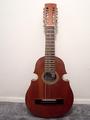
The Guitarby ElCarniceroComment: Needs some very judicious cropping, and a much better setting than carpet. |
| 04/08/2002 12:48:00 AM |
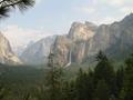
valleyby bobgaitherComment: Mister Frodo! Your ring! You dropped it, sir! Very nice. |
| 04/08/2002 12:39:00 AM |
|
 Photographer found comment helpful. Photographer found comment helpful. |
Home -
Challenges -
Community -
League -
Photos -
Cameras -
Lenses -
Learn -
Help -
Terms of Use -
Privacy -
Top ^
DPChallenge, and website content and design, Copyright © 2001-2025 Challenging Technologies, LLC.
All digital photo copyrights belong to the photographers and may not be used without permission.
Current Server Time: 03/12/2025 02:33:09 PM EDT.