|
|
| Image |
Comment |
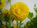
| 04/29/2002 12:55:00 PM | Looking up at Yellow flowersby DominicComment: Most of my comments thus far have commented on how most of the pictures will probably not be scored as well as they should be because they might lack in fulfilling the requirements of the challenge. I've tried to be lenient in my grading thus far, but with this picture I feel like I have to subtract a bit. If this flower is above the camera, then why isn't there sky behind it? If the camera is in front of the flower, then it is basically an angle of 1 or 2 degrees. Like I said, normally I don't care about this stuff, but I get lost in this picture in terms of finding the sky or the ground or any other refernce points. You did a great job of capturing the color and texture of the flower, and especially the stems. You also did a great job of getting the flower in focus with everything behind just a little bit blurred. But that's not good enough to save you losing a few points :) Sorry! :) And sorry again, because I'm sure you're hearing this over and over from other voters and getting annoyed by it :) |
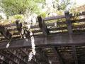
| 04/29/2002 12:30:00 PM | Hangoverby tr13o10Comment: I gave this photo an average score. It wasn't bad, but it has more potential in there to be better. For example, the wood for the bridge or whatnot doesn't really have any richness or texture to it. The trees overhead seem kind of washed out a bit, perhaps by the sun or the lack of detailed separation with the whitish flowers. I think the focus of the picture is the hanging white flower, and I feel that this would have been a stronger picture if you got up close and personal with it. Keeping it off-center is fine, but closer is better. I can't really make out any detail of the white flower, but if it were there it would have been an incredible picture. |
| 04/29/2002 12:45:00 PM | a quiet dayby lecookComment: I like the hazy sky and the rich green grass, though it could have been in better focus with the macro feature, if you have one. Same with the colorful object in the foreground. You did a good job of getting a sense of up with the tall trees, though I fear it might not be whip-lash inducing enough of an UP angle to please the crowd. |
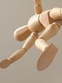
| 04/29/2002 02:50:00 PM | Wooden Mannequinby RemieComment: How odd that we have two uniquely creative photos that are so similar! Your photo does a great job of getting the texture of the wood, but it seems kind of too sharp, like there are little speckles throughout the photo. As well, some of the wood seems to be slightly out of focus, such as the foot. I think with this picture, the image isn't very deep in terms of field of depth, and doesn't suggest an image that should have parts in and part sout of focus. Does that make sense? Nice and simple - good job :) |
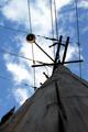
| 04/29/2002 12:21:00 PM | Power Linesby AndyLeeG4Comment: I really like in-focus/out-of-focus pictures, so maybe this is just my own personal "thing", but the only suggestion that I can give here is that it would have been nice to have gotten the pole more in focus, even if that meant using the macro feature to get the base in focus, and everything else more blurred. Then again, a lot of people don't seem to appreciate that style, so my suggestion is probably bad. Nice coloring on the sky - it's hard to get a rich blue color, yet get the clouds that nice as well, yet still have the pole lit enough to have detail and texture. Good job overall. |
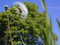
| 04/29/2002 02:47:00 PM | Blowin' in the Windby risu81Comment: What great focus you have in this picture! That dandelion is the focal point, and appropriately, it is in great great focus, while everything else has a nice blur to it. That's great use of manual focus, and not a lot of people seem to be as good at it, which is why I have to bring it up :) Nice framing, though I would have waited for the airplane trail to dissolve, if I could have, as it is somewhat distracting (on the minor, nitpicky level). Good shot, and one that I am sure will be among the top contenders this week. |
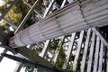
| 04/29/2002 01:49:00 PM | Fractals Entering Cartesian Spaceby ReignComment: I can see why people might say they get dizzy looking at this picture. It's an odd angle - this takes away the sense of up and down. It definitely suggest UP, but a falling out of a parachute up, if that makes sense. I might have tried to get better lighting for this picture, if that was at all possible, and I might have tried to get the main beam (and the secondary, smaller ones) in better focus, either with manual focus or macro, to see if you could capture more of the nice texture from the picture. I wish you could have brought out the foliage more, and maybe dulled the bleached out section in the lower left hand corner of the picture, maybe cropped the lower-right hand some to bring more attention to the main beam, and somehow brought out the nice colors, too. That's a lot to ask, and I have no idea how I would even hope to accomplish it. This is a very good picture overall, and a very challenging one at that. You deserve a good score for this one. |
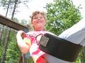
| 04/29/2002 12:47:00 PM | Freedomby sonicblisComment: This is another photo that, I am guessing, you'll probably lose points on to the crowd at large because of a lack of a neck-straining sense of UP in the picture, though the subject does a great job of giving you that feeling :) There is amazing focus in this picture... I mean, even the background trees have a fairly rich texture to them, and the picture is amazingly colorful and fairly well framed. It looks like, from the quality, that you probably know how to improve this one better than I :) Good effort :) |
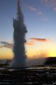
| 04/29/2002 12:16:00 PM | Reaching the skyby arnitComment: I don't get the whole "fitting the challenge category" idea. I mean, is the camera supposed to be on the ground, showing the ground, and looking up? And if it doesn't do that, it's not a good picture? I don't know. Nice coloring in this photo. I would have tried to zoom in a bit more on the smoke, and tried to get more of the texture defined. I did like it off center with the sun coming up on the right, though... just a slightly tighter cropping. Nice color transition, too, by the way. Sharp photo. |
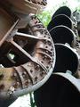
| 04/29/2002 01:13:00 PM | Dredge it upby yyyapComment: I'm a sucker for anything that even smells of old-fashioned. Rust is a sure winner. I love this picture, and I love the way that it is framed, and I love the texture of it, and especially the coloring. Even a few little splotches of mold! Perfect. The "bowls" (I have no idea what this object is... some kind of dredging device, judging by the title) give a good sense of upward lift to the picture. I guess my only critiques are that the bowls seem too shadowed, and the grass to bleaches, especially in the lower portion of the photo. I know how difficult shooting in bright light, objects that are facing away from the sun is, so I won't dock you much for it, but perhaps that is an area where you could have really taken this challenge with ease. Otherwise, I still feel it is one of the strongest submissions in the field. Good job! |
Home -
Challenges -
Community -
League -
Photos -
Cameras -
Lenses -
Learn -
Help -
Terms of Use -
Privacy -
Top ^
DPChallenge, and website content and design, Copyright © 2001-2025 Challenging Technologies, LLC.
All digital photo copyrights belong to the photographers and may not be used without permission.
Current Server Time: 03/12/2025 03:33:41 PM EDT.
|